Please update your browser to fully enjoy this website.
Swiss Graphic Design and Typography Revisited
A collaborative research project by HGK Basel,
HKB Bern, Universität Bern, HEAD Genève,
ECAL Lausanne, SUPSI and ZHdK Zürich.

Swiss Graphic Design and Typography Revisited

Journal

“Swiss Graphic Design Histories” now available

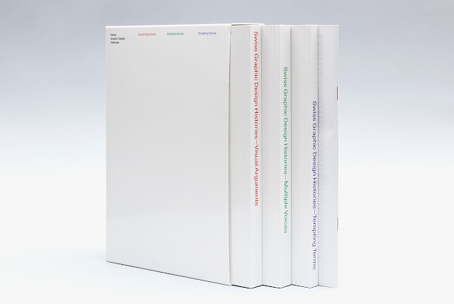
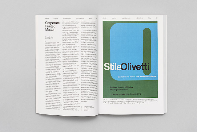
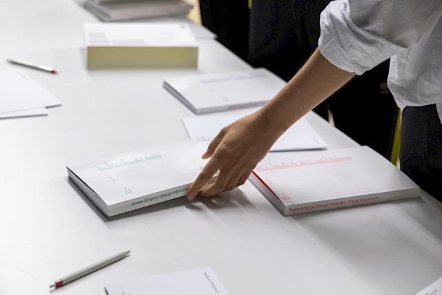
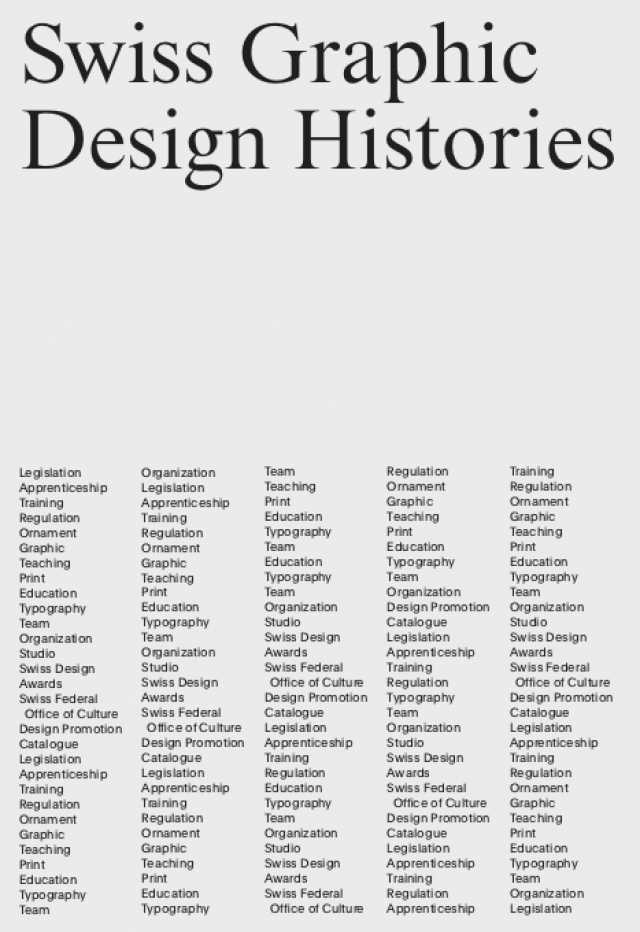
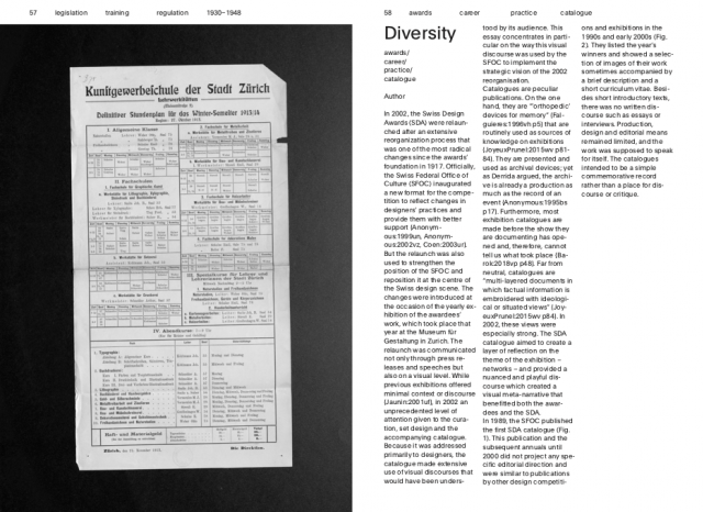
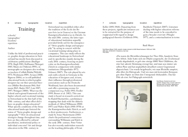
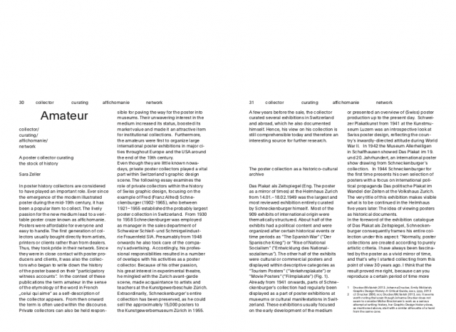
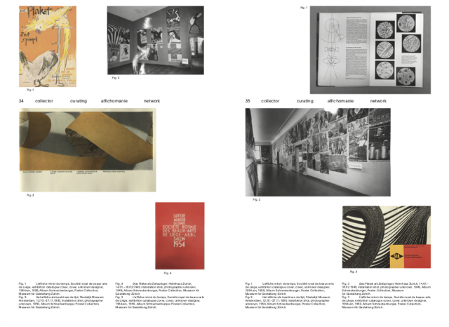
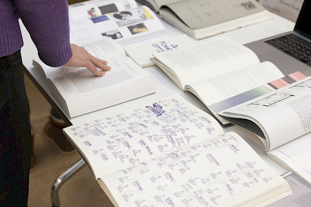
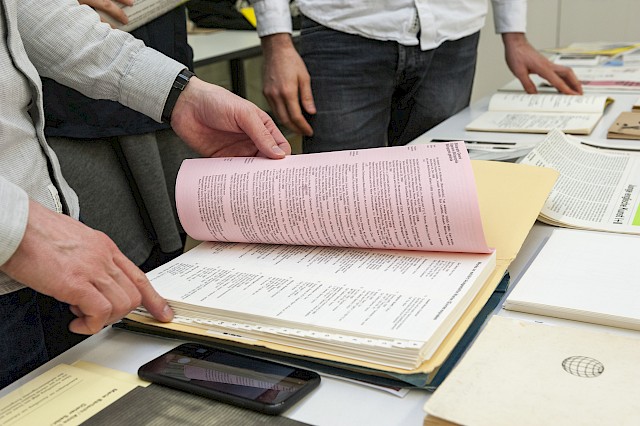
As the main output of “Swiss Graphic Design and Typography Revisited”, the entire research team contributed to “Swiss Graphic Design Histories”, a three-volume publication. It publishes the findings in a form that should appeal to an academic and non-academic audience and makes available the large amount of diverse data and sources that we have analyzed for more than four years. It is entirely available in open access under a CC BY NC ND 4.0 license on the website of Scheidegger & Spiess and as a high-quality printed edition designed by Simone Farner and Naima Schalcher in a slipcase.

“Swiss Graphic Design Histories” offers a redefinition of Switzerland’s graphic design landscape. Based on the extensive research done in line with the project’s multiple and inclusive approaches, the publication reaches beyond the usual canon and the well-known epicentres with the Germanophone fathers of what has become famous as the Swiss Style.

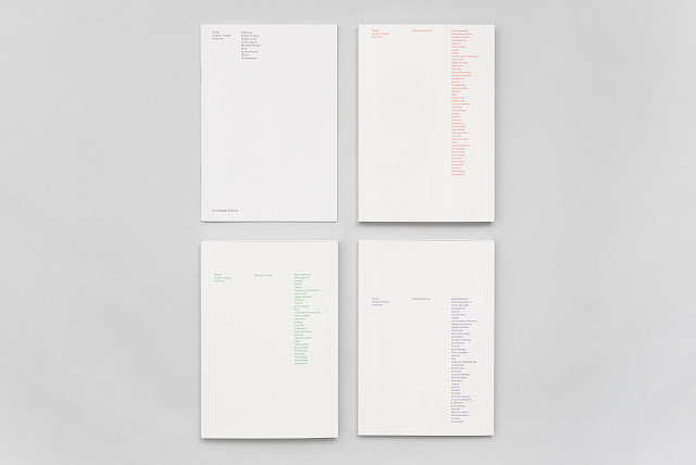
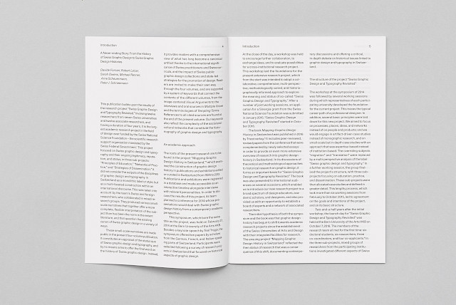
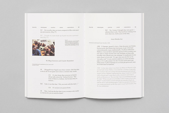
In its three volumes, it features visual artefacts and archival documents, the majority published here for the first time, alongside likewise previously unpublished conversations with designers who have forged developments of the past decades, as well as new essays discussing key terms that refer to various design practices. The complexity of the undertaking is embraced through a system of keywords, thus enabling readers to connect contents within the individual volumes. An additional booklet comprising a glossary, bibliography, and an index of the keywords rounds out this long-awaited new survey of graphic design in multi-lingual Switzerland that sheds new light on networks, practices and media largely ignored so far.

Our research activities have not ended with the present publication. Further individual findings from the project will be discussed and published independently by our doctoral students as part of their theses. We hope they will continue the academic discourse in graphic design history in Switzerland, conduct further research, and ultimately assume positions from which they might pursue additional topics in this vein.

The publication is supported by the Swiss National Science Foundation, Pro Helvetia, Burgergemeinde Bern, Stadt Zürich Kultur, as well as by the participating universities: HKB Bern University of the Arts, ZHdK Zurich University of the Arts, FHNW University of Applied Sciences and Arts Northwestern Switzerland, ECAL University of Art and Design Lausanne, HEAD – Genève and SUPSI University of Applied Sciences and Arts of Southern Switzerland.

With contributions by Chiara Barbieri, Rudolf Barmettler, Jonas Berthod, Sandra Bischler, Constance Delamadeleine, Davide Fornari, Roland Früh, Ueli Kaufmann, Sarah Klein, Robert Lzicar, Jonas Niedermann, Sarah Owens, Michael Renner, Peter J. Schneemann, Arne Scheuermann and Sara Zeller.

Photos © ECAL / Niccolò Quaresima.

Launch of “Swiss Graphic Design Histories”

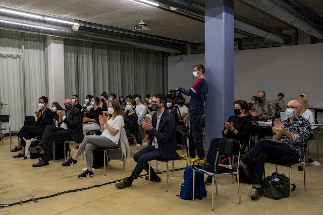
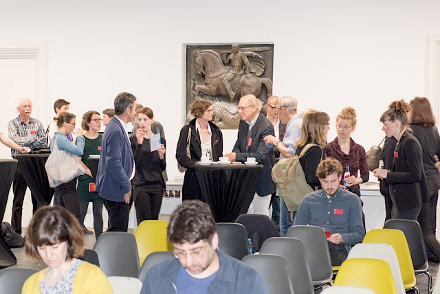
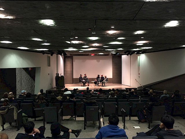
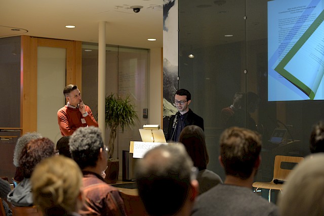
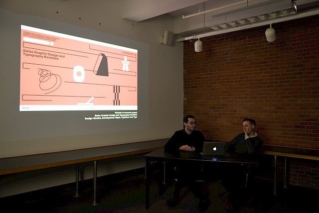
Almost five years after the kick-off day of “Swiss Graphic Design and Typography Revisited”, the launch, presentation and celebration of the final publication “Swiss Graphic Design Histories” (Scheidegger & Spiess) was held on 1 July 2021 again in the Grossen Aula of the Bern University of the Arts HKB.

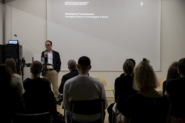
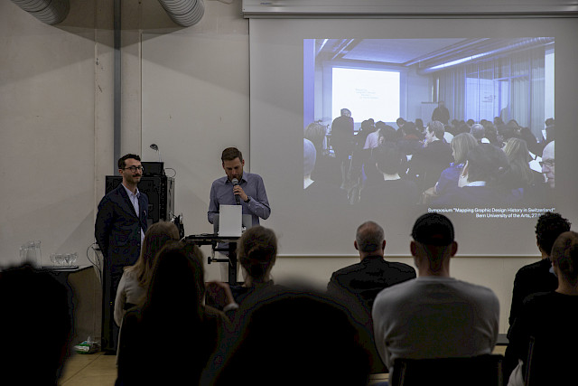
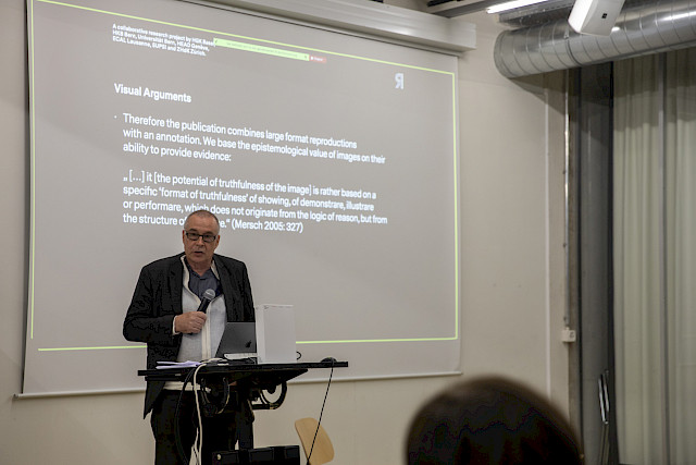
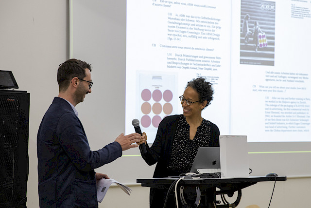
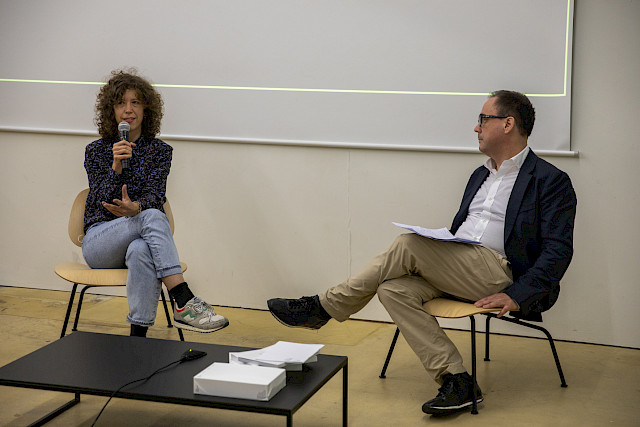
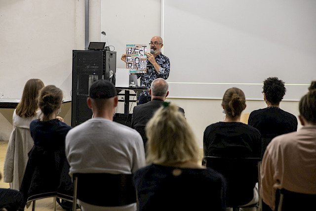
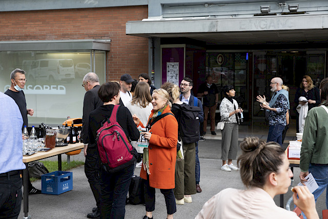
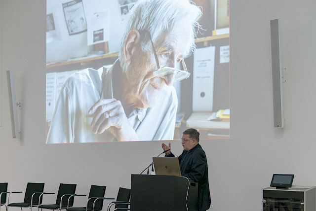
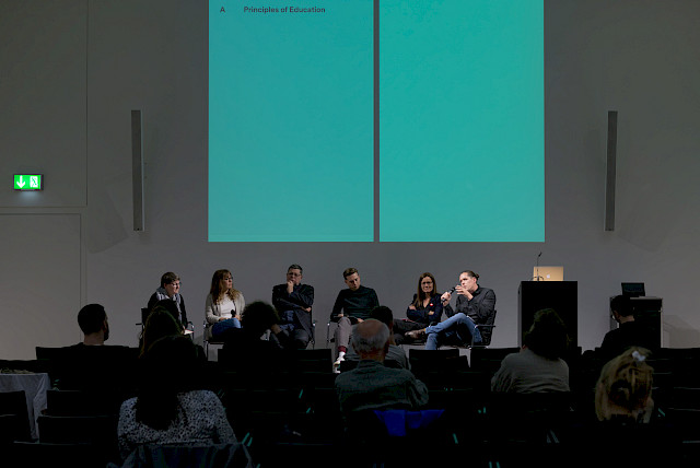
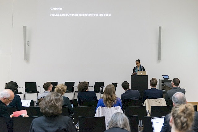
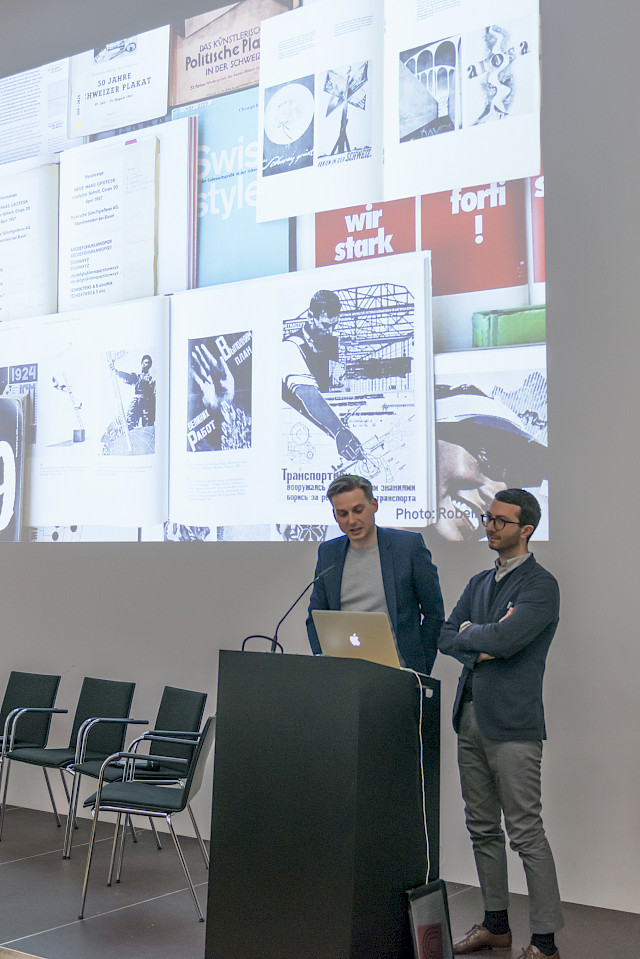
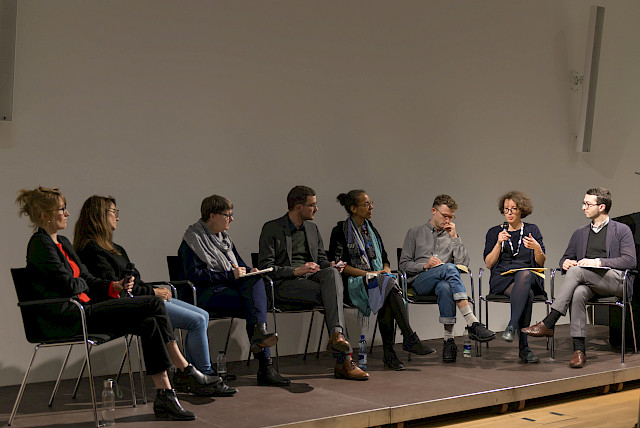
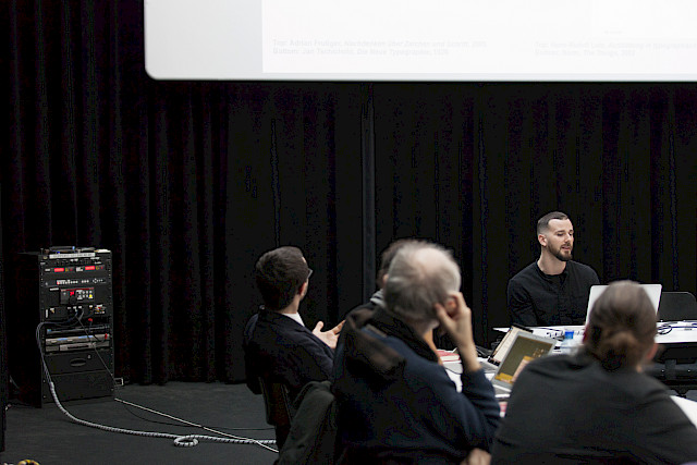
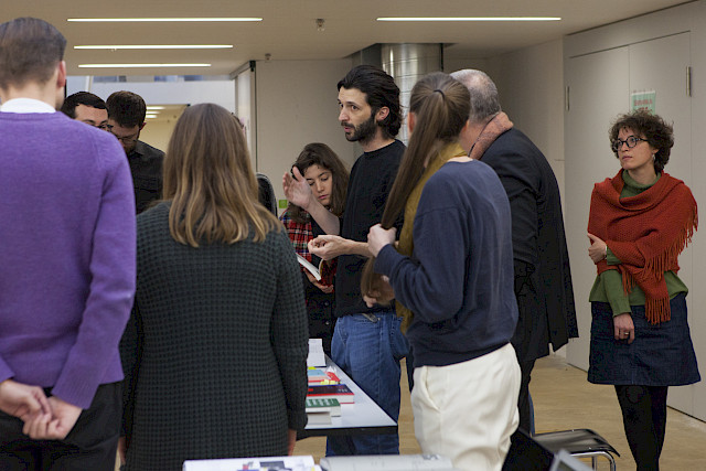
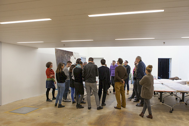
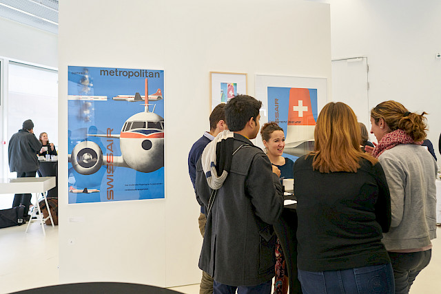
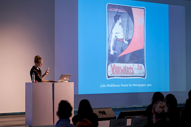
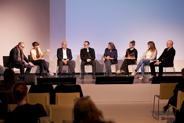
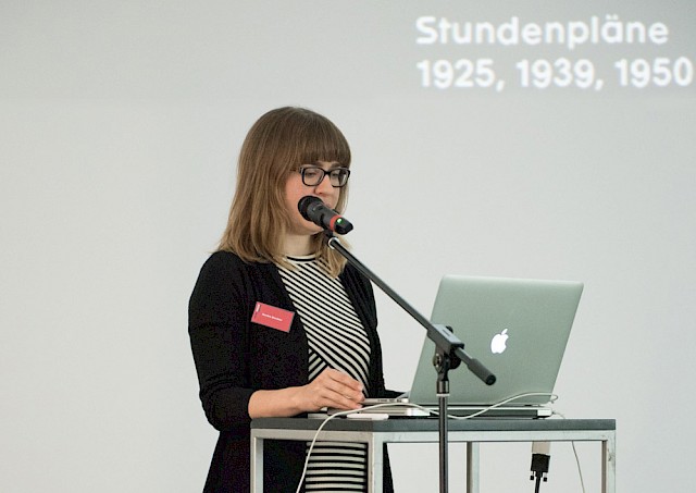
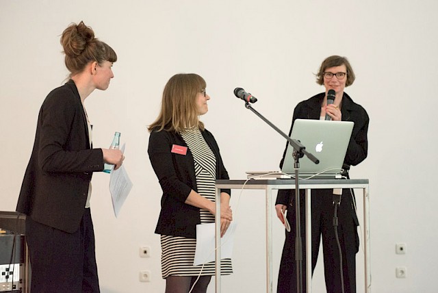
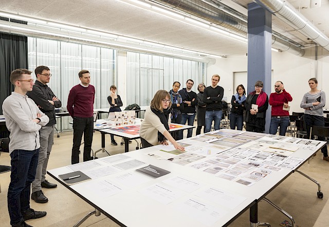
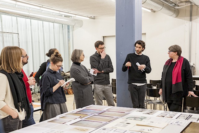
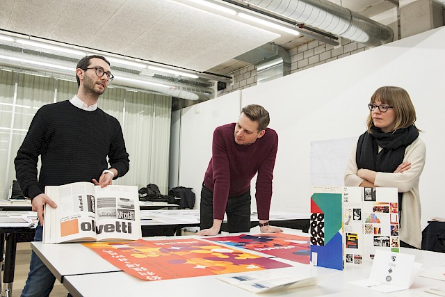
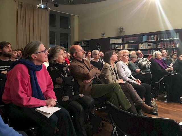
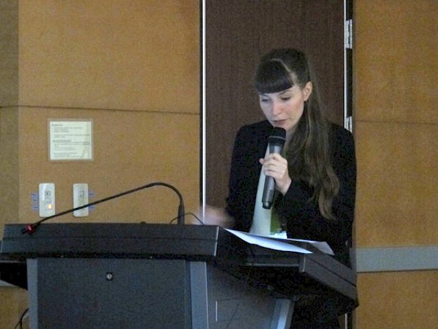
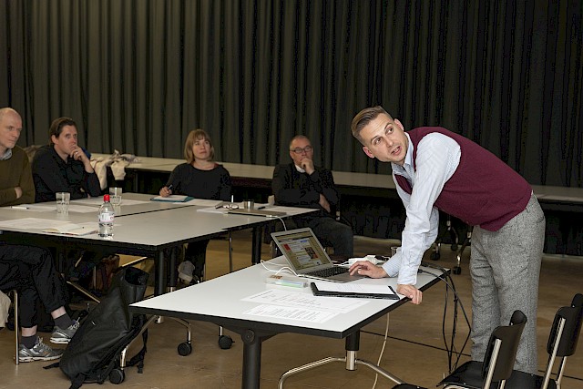
It was a beautiful conclusion with about 40 participants on-site and a bit more following the event online under the moderation of Robert Lzicar (project co-coordinator). After the greetings and words of thanks by Arne Scheuermann (main applicant and HKB Institute of Design Research) and Thomas Kramer (Managing Director of Scheidegger & Spiess), Davide Fornari and Robert Lzicar as editorial coordinators introduced this extensive publication project revealed the roots of the project and the publication and gave insight into the production process. Afterwards, all three volumes were presented by representatives of the respective editorial teams: “Visual Arguments” by Michael Renner and Sandra Bischler, “Multiple Voices” by Sarah Owens and Davide Fornari and “Tempting Terms” by Sara Zeller and Ueli Kaufmann. They explained the concept of the volumes by using examples from each volume. In the spirit of the project’s subject, the publication’s design plays a central role in communicating the research results. Accordingly, in conversation with the publisher, one of the publication’s two designers, Naima Schalcher, explained key decisions for the design concept and about the process and challenges of graphic design as content. The event was rounded off by closing words from Robert M. Stutz, the President of the Berner Design Stiftung, which supported the event in the form of an aperitif and thus contributed to the great atmosphere of the evening.

Photos © Fine Bieler, HKB Medialab.

Design Issues Special Issue “New Perspectives on Swiss Graphic Design”

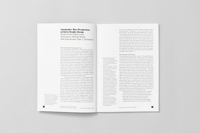
In January this year, the special issue “New Perspectives on Swiss Graphic Design” of the renowned journal Design Issues (MIT Press) was published. It includes an introduction by the guest editors and five articles building on the results of SGDTR, which is available in full access through April 2021.

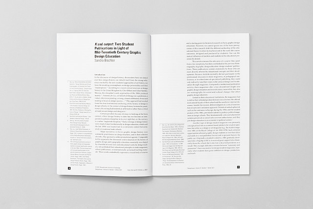
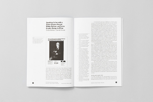
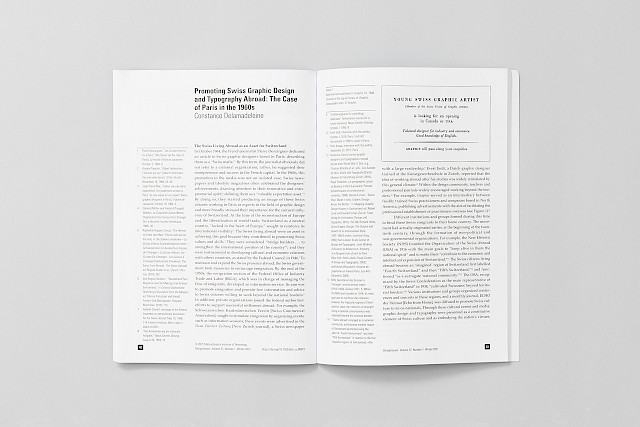
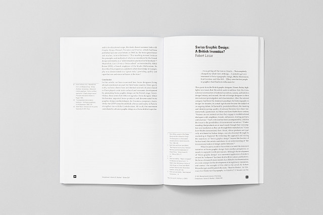
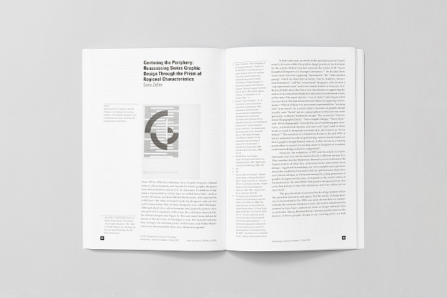
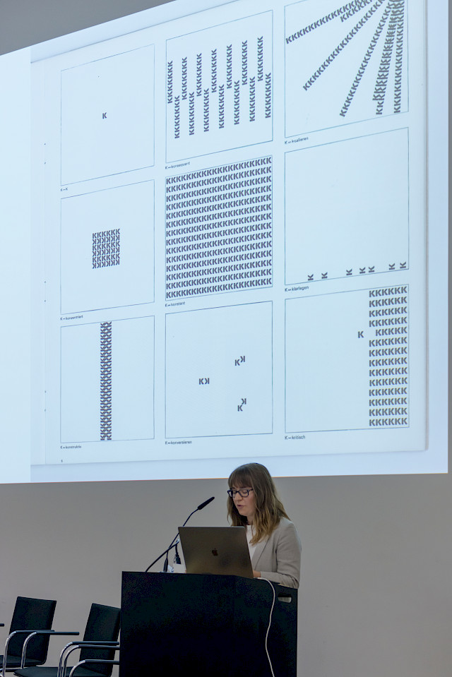
Within the publication strategy of our research project, the Design Issues special issue focuses on historiographical and methodological challenges from our research that might be of interest primarily to other design researchers. It includes an introduction by the guest editors, as well as various small-scale narratives that together offer a more complete and flexible interpretation of “Swiss graphic design and typography” than extant literature has constructed. These narratives question the established perspectives on Swiss graphic design in a variety of ways: To make accessible the previously unheard voices of students on design education, Sandra Bischler focuses on “K”, a magazine edited and published by a group of students at the Allgemeine Gewerbeschule Basel (Vocational Trade School, later the Basel School of Design) in the early 1960s. Chiara Barbieri and Davide Fornari question the common criticism of the monographic approach in design history and thus the often-repeated rhetoric that hailed graphic design in Milan as a mixture of Swiss precision and Italian poeticism. But if it wasn’t precision, what made Swiss graphic designers so successful abroad? Constance Delamadeleine traces different stakeholders in Paris in the 1960s and examines their agendas and strategies in a larger economic context. Swiss graphic designers were not solely responsible for the international success of Swiss graphic design, as Robert Lzicar illustrates. He examines the role of British practitioners in the dissemination of the label as a transnational process. Finally, the fact that graphic design in Switzerland itself in the 1950s was more diverse than hitherto assumed is shown by Sara Zeller using the example of the local design scene in Bern.

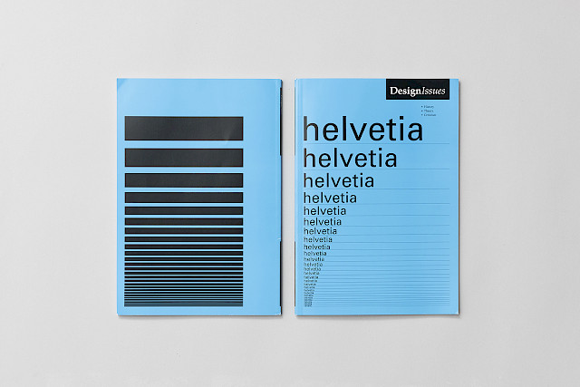
The special edition comes with a cover designed by the Zurich graphic designer Viola Zimmermann. It visualizes the stereotypical modernism that has been associated with Swiss graphic design and typography thus far. Helvetia is the national personification of Switzerland and, as such, was the inspiration for Linotype’s renaming of the Neue Haas Grotesk to Helvetica in 1960. Its competition with the Univers type system by Deberny & Peignot, in which the cover is set, is a legendary chapter in the canonized historiography of Swiss typography. At the same time, the cover represents the decreasing relevance of national historiography in design, which this special edition addresses.

Photos © Niccolò Quaresima.

“Swiss Graphic Design Histories” and “New Perspectives on Swiss Graphic Design”

If you are wondering what is going on with SGDTR, we have been writing for the last few months and would like to announce our publication plans today: On the one hand, we are currently editing a comprehensive publication with contributions from all three sub-projects and nine case studies that will be published by Scheidegger & Spiess. It is aimed at researchers, graphic designers and a broad culturally interested audience. On the other hand, we submitted a proposal for a special issue of the renowned academic journal Design Issues.

Already in the project application we have formulated the claim to publish our findings in a form that also appeals to a non-scientific audience, especially practicing designers, and to make our material available for follow-up projects in order to foster academic discourse in graphic design history in Switzerland. The two publications are now intended to fulfill this claim.

“Swiss Graphic Design Histories” (publication planned for Fall 2020) aims to review existing narratives and to identify previously overlooked networks, practices and media. It is an attempt at describing the landscape of Swiss graphic design with a multiple and inclusive approach. It presents for the first time a large number of unpublished conversations with designers, archive material and contributions from design historians that go beyond the usual canon.

The publication consists of four volumes: The volume “Visual Arguments” focuses on the presentation and analysis of archive material – from graphic artifacts to timetables or correspondence. The aim of the volume “Multiple Voices” is to make quotes and extracts from interviews with designers, who contributed to defining the status of Swiss graphic design, accessible by grouping them thematically. “Tempting Terms” contains essays that refer directly to the phenomena of graphic design in Switzerland and raise new questions. All volumes are linked and indexed by keywords to allow cross-references and navigation between sources. The last volume makes the other three accessible by means of a foreword, the profiles of the contributors, lists of keywords and abbreviations and the bibliography of all volumes.

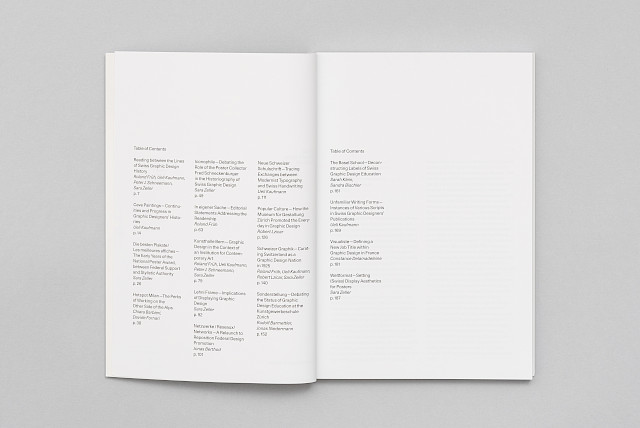
According to the object of research it was our concern to create a specific form for the contents. From a shortlist of renowned graphic designers and studios, Simone Farner and Naima Schalcher were commissioned to design “Swiss Graphic Design Histories”. With their publications for Hier und Jetzt Verlag, they have already proven able to reconcile scientific and creative demands. The studio is currently working on further developing the design concept. You can find pictures of the layout accompanying this article and soon in the preview by Zurich-based publisher Scheidegger & Spiess. At the same time as the printed version, all content is going to be published digitally as an open access publication in agreement with the ​Swiss National Science Foundation (SNSF) gold road. In this way, we ensure interested parties who cannot purchase the book can also access the contents.

While this multi-volume publication is aimed at a broad audience, our proposal for a special edition of Design Issues titled “New Perspectives on Swiss Graphic Design” focuses on historiographical and methodological challenges from our research that might be of interest primarily to other design researchers. Five papers were selected for the proposal, representing a range of the phenomena studied within SGDTR: From the investigation of educational strategies from the rare perspective of students to the critical examination of the potential of monographic research and the reconstruction of the complex definitional processes of Swiss graphic design. The proposal was submitted for review in mid-April to the editorial board, which will decide on its publication. Keep your fingers crossed for us!

Swiss Graphic Design at the CCS in Paris

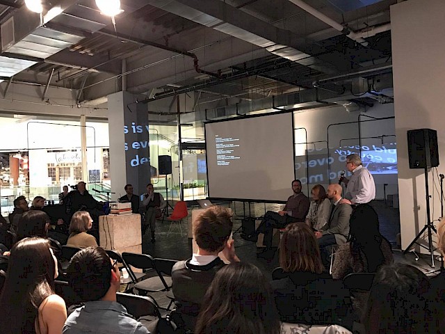
On 6 September 2019, SGDTR researcher Constance Delamadeleine presented her doctoral intermediate results at the Centre culturel suisse (CCS) in Paris, a geographically symbolic site for her research since it deals with the presence of Swiss practitioners in the French capital after the Second World War.

More specifically, the presentation focused on the professional activities and network of Albert Hollenstein, a Swiss typographer who founded his studio in Paris (Studio Hollenstein) in the late 1950s. Through this analysis, it revealed how Hollenstein, supported by a network of different actors (economic, cultural) aimed to promote Swiss graphic design and typography on the French stage. It also stressed the link between this promotional movement and the emergence of the “Swiss living abroad” as a national surrogate of Switzerland. In the period of the reconstruction of Europe, common market and international dialogue, the Swiss living abroad played a crucial role in the economic and cultural expansion of Switzerland and were considered as an asset to strengthen its international position. The Swiss graphic designers and typographers based in Paris were no exception.

In order to give a contemporary perspective to this research, the presentation was followed by a round table discussion with Swiss practitioners based in Paris: Chloé Berthaudin Rombaldi, Diego Fellay, Florence Tétier and Régis Tosetti. The discussion was structured around a pool of questions relating to their professional experience in the French capital. After a short presentation of their career path, they were encouraged to reflect on their perception of Swiss graphic design. All in all, the different accounts revealed the significant role their Swiss training played in their professional career. For example, it facilitated their establishment in the French capital as Swiss graphic design is recognized for its typographic precision and conceptual strength. The discussion also brought to the fore the shared vision and approach of the practice that they developed in Switzerland. Consequently, this common graphic design culture fosters mutual collaborations. To the question “Do you plan to go back to Switzerland?”, they commonly stressed that the Parisian cultural and artistic climate provides them with new sources of inspiration they could never find in Switzerland.

DRS LearnXDesign conference 2019

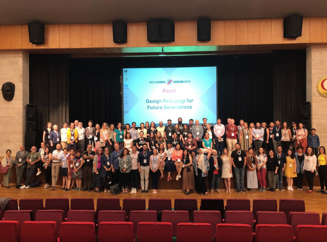
The Design Research Society Special Interest Group in Design Pedagogy (DRS PedSIG) organized their biannual conference at Middle East Technical University (METU), Ankara, Turkey from 9 to 12 July 2019. Under the claim “insider knowledge” the conference brought together design researchers, educators, practitioners, and other experts with a focus on design education.

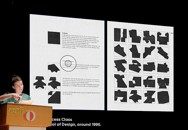
The presentations provided by the delegates from design educational institutions of all parts of the planet introduced in large parts contemporary design pedagogical projects, methods and their evaluation. In this context, the strand “Rethinking Design Basics as Translation” chaired by Dr. Elena Caratti of the Politecnico di Milano, offered a distinctive perspective borrowing theories from the field of translational studies. As part of the strand, “Swiss Graphic Design and Typography Revisited” co-applicant Michael Renner and PhD candidate Sarah Klein of the subproject “principles of education” examined three historical examples of basic design exercises from the perspective of translation under the title “Translational Aspects of Basic Design Exercises”. Their paper investigates, how basic design teaching can be understood as a translation of experience from an instructor to a learner. The Conference Proceedings will be available from September 2019 at https://www.designresearchsociety.org/cpages/design-pedagogy-sig.

The range of papers, keynote speeches and workshops held throughout the conference revealed common grounds regarding problems in contemporary design education. Recurring topics during the conference were sustainability and the role of design within the consumer culture, the importance of (soft-) skills, gender questions and the implementation of theory in design education. These topics have hardly been dealt with in the SGDTR project so far and have potential as follow-up questions for future research on Swiss graphic design and typography.

Experts’ Panel Meeting 2019

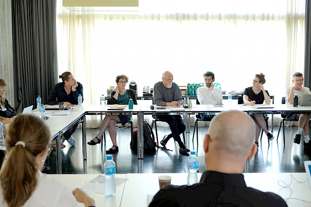
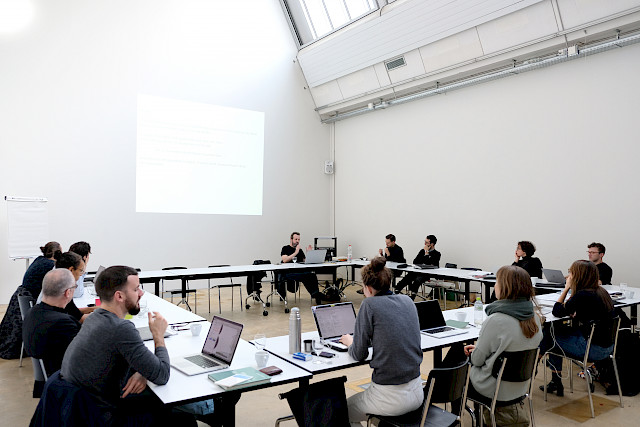
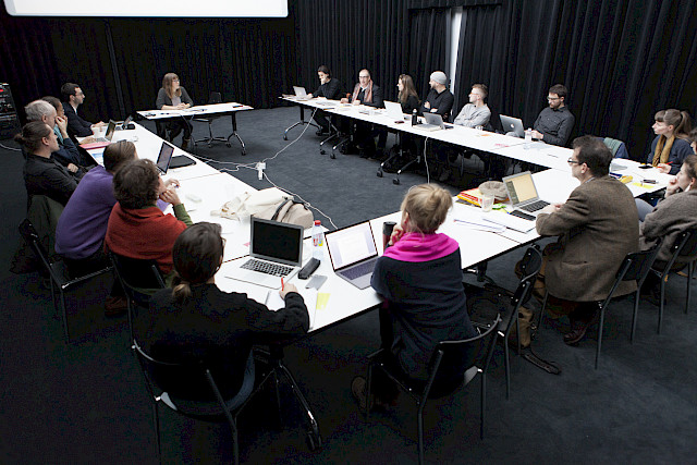
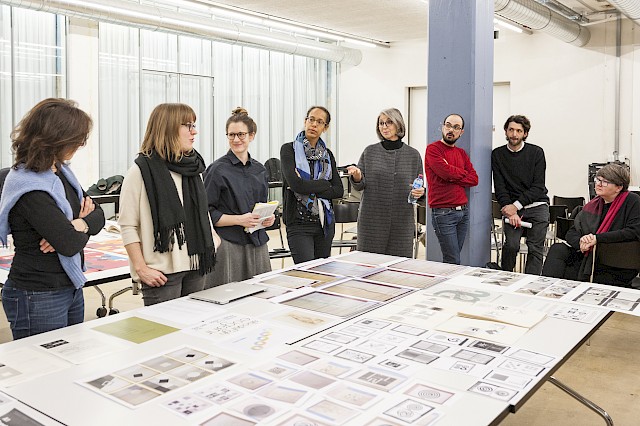
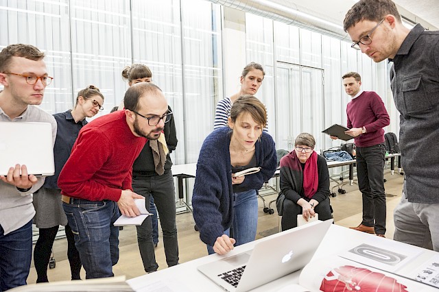
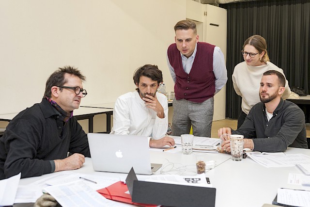
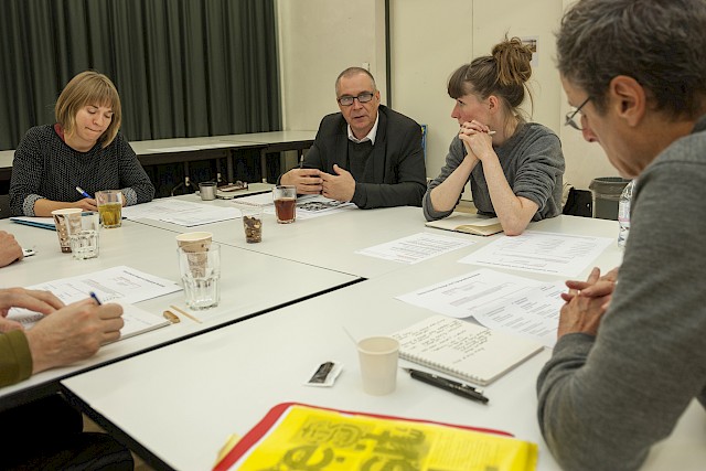
The third SGDTR Experts’ Panel Meeting took place on 5 July 2019 at HEAD Genève. It was planned as a work-in-progress workshop dedicated to refining the project’s publication strategy and supporting the writing process.

Main applicant and project coordinator Prof. Dr. Arne Scheuermann opened the day with a warm welcome to the whole team of SGDTR doctoral students, researchers, coordinators and applicants. He provided a status quo of the overall project and the publication strategy. Thus, the results of “Swiss Graphic Design and Typography Revisited” will be disseminated in a comprehensive publication with contributions from all three sub-projects and nine case studies in three volumes. All volumes are connected and indexed according to several keywords in order to allow cross-references and navigation among sources.

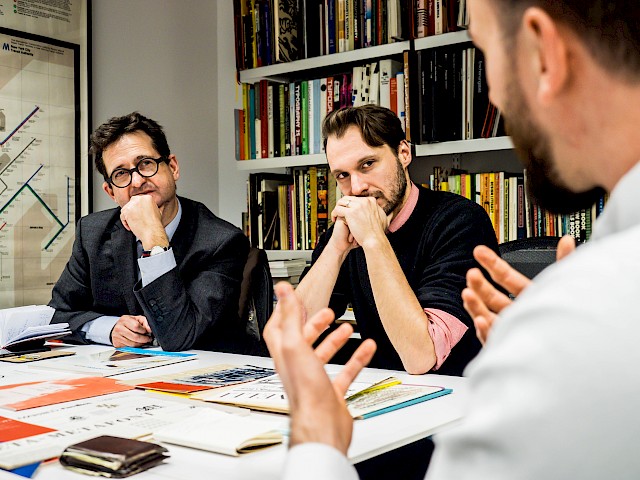
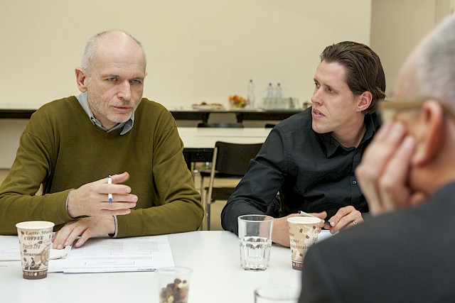
The introduction was followed by a short presentation by every sub-project on the progress of their contribution to the final publication. Afterwards, the experts were welcomed to this year’s meeting: Prof. Dr. Jeremy Aynsley (Brighton University), Prof. Dr. Barbara Bader (Akademie der Bildenden Künste Stuttgart), Prof. Dr. Catherine de Smet (Université Paris-VIII) and Prof. Dr. Teal Triggs (Royal College of Art, London). Before the meeting, the experts had received drafts of scientific papers, written by the SGDTR researchers, and were asked to prepare a review for the meeting. In their general feedback, the experts emphasized the wide variety of texts, to be written for a range of audiences, and the challenges arising from this. The following one-on-one meetings between experts and researchers gave an opportunity to discuss the drafts in-depth by focussing on writing technique, theoretical foundation, argumentative structure and contextualization.

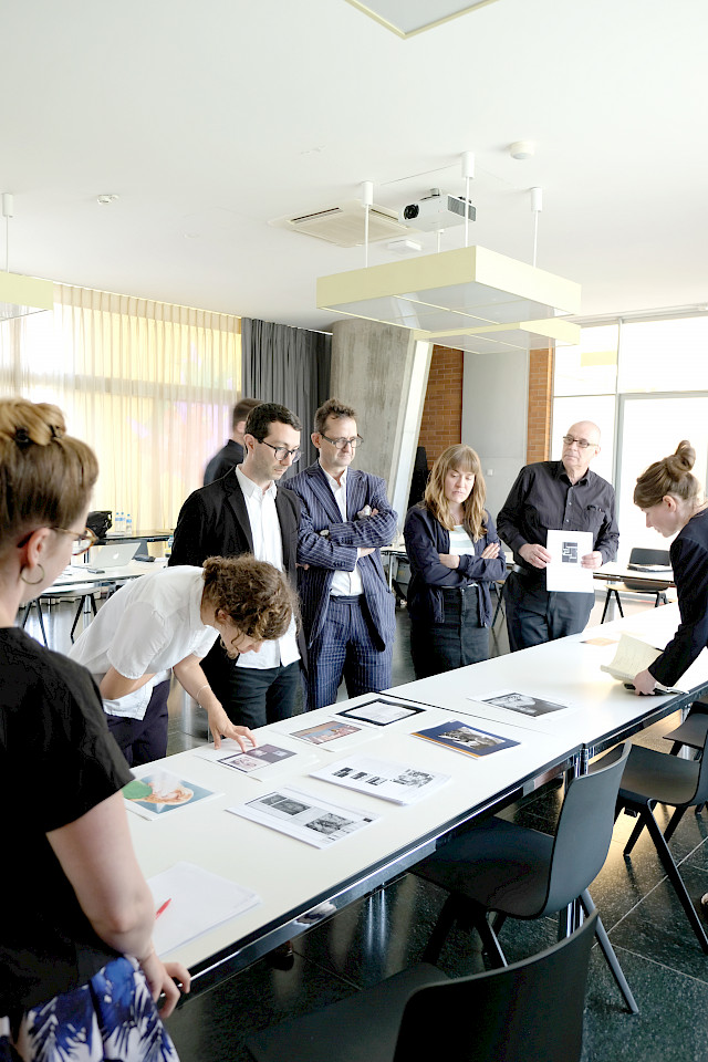
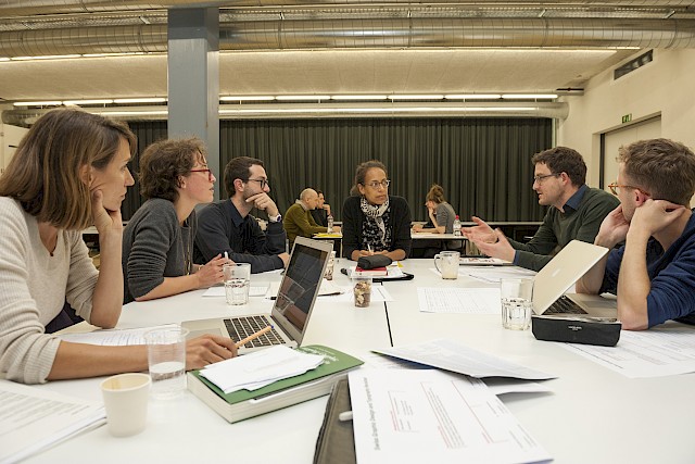
Parallel to the one-on-one meetings, the sub-projects prepared workshops addressing problems in the conception and editing of each volume. The discussions were joined by Naima Schalcher, who together with Simone Farner was commissioned to design the publication. Furthermore, synergies across sub-projects’ borders were established and feedback on previous text contributions by other researchers was given.

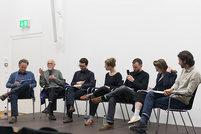
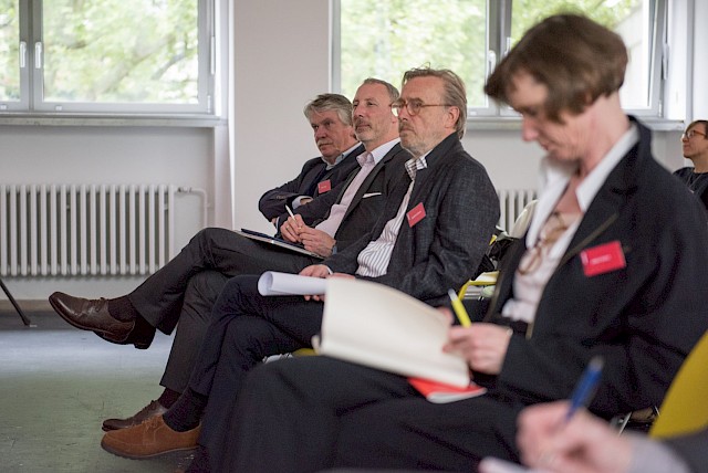
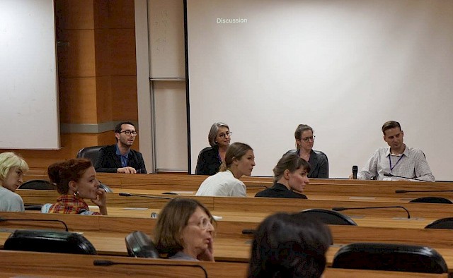
The extensive one-day program concluded with a short panel discussion with the entire research group. The experts emphasized the need to frame texts with a focus on the overall project’s objectives and highlighted the importance of mentoring during the writing process for the following months.

Research Team Meeting 2018: Learning about national identity and writing English

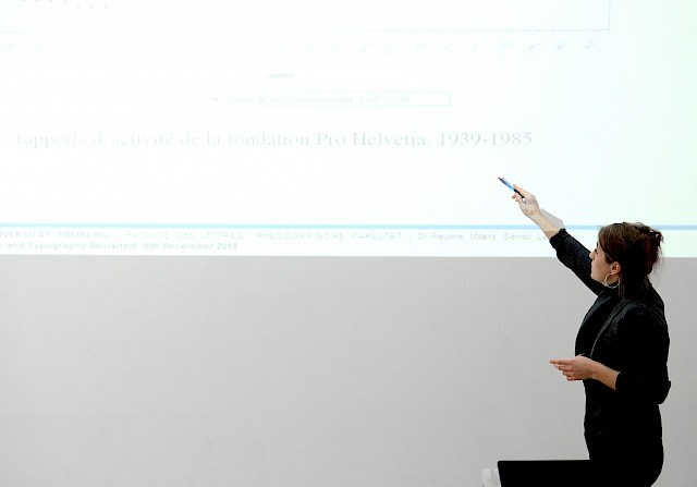
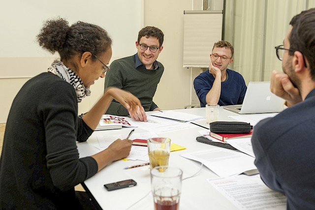
On 6 December 2018, the SGDTR research team gathered in Bern for the yearly meeting. Dr Pauline Milani, University of Fribourg, opened the day with a seminar on “History of Cultural Policies: Methods and Approaches”. Milani gave an insightful presentation, citing information from her research on Swiss cultural promotion and the institution Pro Helvetia, and questioning common definitions of national identity as they are used in the description of SGDTR.

According to Milani, at around the 1930s to 1940s Switzerland had seen its cultural politics and cultural identity defined by turns in social, cultural, political and economical history – such as the Sonderfall Schweiz status, or the ideology of Geistige Landesverteidigung. This national history was still being mythologized in the 1970s when intellectuals began to doubt the idyllic, the Fichen-Skandal showed a nasty side of the state and the Bergier commission did the rest to denounce the myth of the Sonderfall and neutral state. “What is your definition of ‘Swiss culture’? ‘What is Swiss identity?’ Which documents do you refer to?” asks Milani and so she raises awareness for the sensitivity of definitions of national culture and identity. The social, cultural and economic context of a specific moment in time must be taken into account. Are we referring to a specific date, before, during or after the (de)construction of a terminology?

The second part of the SGDTR Research Team Meeting was dedicated to a writing workshop titled “A very (brief) guide to writing English”. In his presentation, Prof. Dr Chris Walton provided basic English grammar and style principles and reminded us of basic but sometimes overlooked rules when writing in English as a foreign language. Although the bottom line was that English is a very vague language whose rules are difficult to pin down, Walton gave us some key recommendations. The main advice that stayed with us was that the shorter and simpler things are, the better.

We then proceeded to a more practical aspect of the workshop, where Walton compared and commented on two versions of texts the SGDTR researchers had written. Highlighting ways to make the text simpler and more legible, he contrasted the original contribution with his proposals. Perhaps unexpectedly, some of his contributions shifted the meaning of the original written content, suggesting that the original text was not clear enough in its argument. A valuable insight to keep in mind when writing our papers, just as much as when having texts proofread.

ICDHS 10th+1 Conference Barcelona

At the end of October 2018, four members of the SGDTR research project took part in the ICHDS 10th+1 Conference organised by the University of Barcelona, where they all presented papers. Entitled “Back To The Future: The Future In The Past”, the conference was dedicated to the memory of the late Anna Calvera (1954-2018). Organised in three strands – Design History and Histories of Design, Design Studies and an Open Session – the conference took place over three days and saw a large number of papers presented. The diverse range of papers delivered in parallel panels demonstrated the richness and global reach of the conference theme and reflected a wide range of international perspectives on design history.

Our project presented five papers. Chiara Barbieri and Davide Fornari delivered two presentations together. One paper, titled “Uncovering and Questioning Unidesign: Archival Research and Oral History at Work”, presented some preliminary results from their research on Walter Ballmer and Unidesign, while discussing the potential of using archival research and oral history as means of question the historiographical canon. The second paper, “The Lost Typefaces of Xanti Schawinsky: From Bauhaus to Italy”, reported on an on-going research project of the Milanese year of the Swiss Bauhausler focusing on his work as a type designer. Chiara also presented the paper “The Scuola del Libro in Milan at the Center of a Typographic Quarrel” that stemmed from her PhD on the professionalisation of graphic design in Italy.

Constance Delamadeleine presented her research on the business approach of the Paris-based studio Hollenstein (1957-1974), founded by the Swiss-trained typographer Albert Hollenstein. Drawing on underexplored archive material, combined with interviews, the paper titled “The Business Face of Swiss Graphic Design: the Case of Studio Hollenstein” examined the organisational structure and the strategies used to run the Studio. As the material revealed, the notions of “team” and “organisation” emerged as discursive and visual strategies to represent and position the Studio as a collective and professional structure.

Finally, Jonas Berthod presented a paper titled “Casting the Net: Early Career Projects and Network Creation”. It focused on the importance of designers’ first projects in creating and sustaining a professional network. A close analysis of three artefacts based on methods both visual and from oral history showed the relationships that allowed them to exist and how they went on to exert influence on the designers’ networks. These first collaborations have an impact on design careers in a way that is rarely predictable.

The conference was an invaluable opportunity to meet other scholars from the field – both senior and young researchers – and it led to new connections. It also provided the opportunity to present our research to an international audience. The conference concluded with a visit to the newly opened Museu del Disseny, displaying a vast array of collections ranging from product design, fashion design, applied arts, and graphic design.

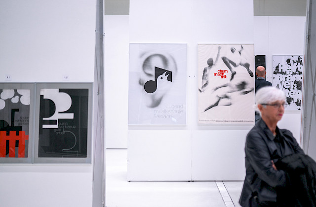
Symposium “Design Prozesse: Peter von Arx – Schrift in Plakat und Film”

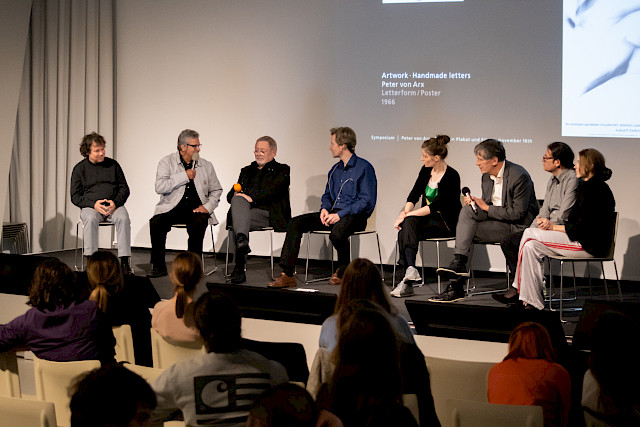
The symposium (16 November 2018) “Design Prozesse: Peter von Arx – Schrift in Plakat und Film” took place at the FHNW Academy of Art and Design Institute of Visual Communication in Basel in the context of the exhibition of the same title (3–30 November 2018). The selection of the speakers on the one-day bilingual symposium offered a wide range of perspectives. Current and former teachers, students, graduates and researchers approached the subject from their different generations’ points of views and connected it with contemporary, theoretical, applied or historical issues.

A very visual opening was offered by Heinz Hiltbrunner, a former student of Peter von Arx, and later teacher at the same school. His autobiographical lecture provided insights in his graphic design learning, practice and teaching processes. The former film teacher at the Institute of Visual Communication – Reinhard Manz, talked about the technology within the “Filmgrafik” course in the 1960s and on the problems of archiving. His explanations culminated in the screening of several flickering black and white typographic animations by Peter von Arx – hardly bearable to watch on the one hand, marvellously fascinating on the other.

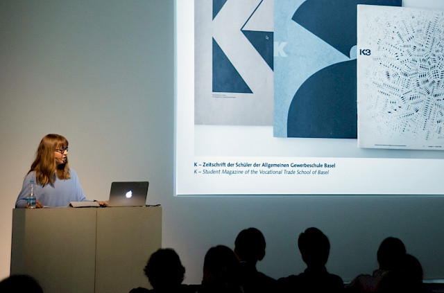
The bilingual contributions by SGDTR PhD-candidates Sandra Bischler and Sarah Klein both took a historical focus. Sandra Bischler revealed the viewpoints of the graphic design students of the Basel School of Design in the 1960s according to the student's magazine “K”. Sarah Klein presented her archival research on the graphic design teaching of Hermann Eidenbenz, who taught at the Basel School of Design generations before von Arx.

After lunch two speakers addressed contemporary typographic issues. Kobi Franco, Head of the Graphic Design studies at the Visual Communication Department at Shenkar – Engineering, Design and Art College in Ramat-Gan, Israel, showed a various number of works by his students. To fully enjoy or judge the quality of typographic work, the ability of reading the texts is a precondition. The fact that most of the audience were not able to read Hebrew obviously complicated the debate. But also on a formal level, the colourful approach, from streets inspiration over digital typography to humorous animation appeared exotic. While comments by an older generation – former teachers – were very critical or uncomprehending, the younger generation – the students – responded rather positive.

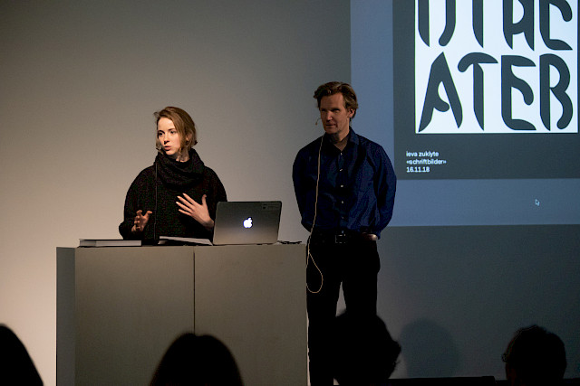
Ieva Zuklyte presented her 2018 graduate project from the Master in Visual Communication and Iconic Research "Typographic Images". She introduced her design process as a highly systematized method and combined this with an individual subjective decision-making.

The last two contributions came from current teachers at the Visual Communication Institute in Basel. Dr. Invar-Torre Hollaus reflected on Peter von Arx posters for cultural institutions from the point of view of an art historian. He described and analysed form, content and institutional background of these works in detail. Prof. Philipp Stamm lastly gave a general lecture on his specific system of typeface classification and connected it to Peter von Arx type designs.

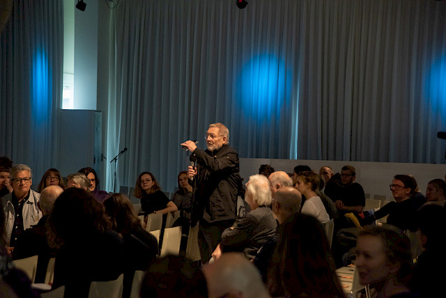
Peter von Arx himself attended the symposium and supported a familiar overall atmosphere. On one side, his presence most likely moderated criticism in general. On the other side, he was able to provide additional background information to his works, which was extremely beneficial for both, the contributors and the audience.

Symposium
https://www.fhnw.ch/de/die-fhnw/hochschulen/hgk/institute/institut-visuelle-kommunikation/forschung-am-institut-visuelle-kommunikation/symposium_peter-von-arx-schrift-in-plakat-und-film

Flyer
https://www.fhnw.ch/de/die-fhnw/hochschulen/hgk/institute/institut-visuelle-kommunikation/forschung-am-institut-visuelle-kommunikation/symposium_peter-von-arx-schrift-in-plakat-und-film/media/181106_ivk_pva_symposium_web1.pdf

My Own Private Swiss Graphic Design History – a Seminar and Exhibition

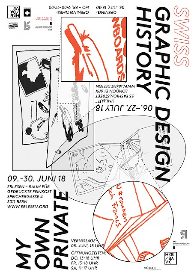
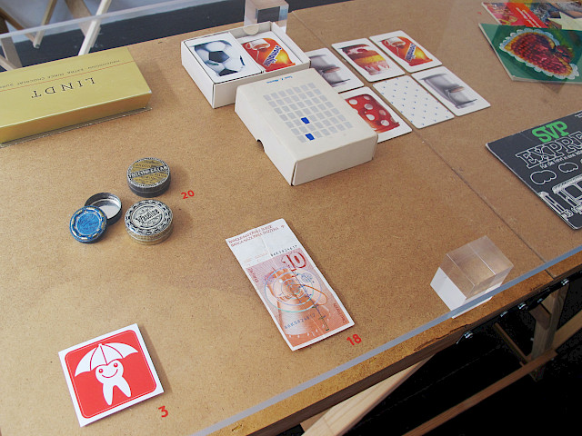
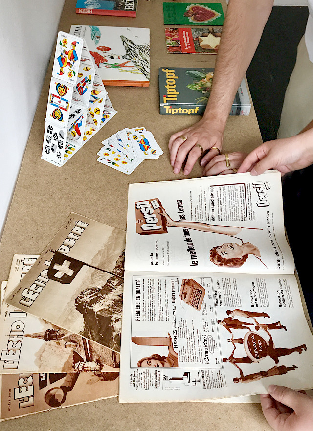
What is Swiss graphic design? Which objects can or cannot be associated with it and why? And what is typically Swiss about them? As part of a graphic design history seminar at the Bern University of the Arts HKB during summer semester 2018, SGDTR-researchers Sara Zeller, Sandra Bischler and Robert Lzicar investigated the historiography of Swiss graphic design together with students of the BA Visual Communi­cation.

The idea of the seminar was that Swiss graphic design history does not only con­sist of “masterpieces,” as it is often shown in design collections, exhibitions, and publications. Interesting examples can just as well be found at one’s own home, at the grandparents’ base­ment, or at the thrift store. Anonymous every­day graphic design of past decades tells relevant stories and, at the same time, allows to complement well-known historical narratives with alternative and personal approaches.

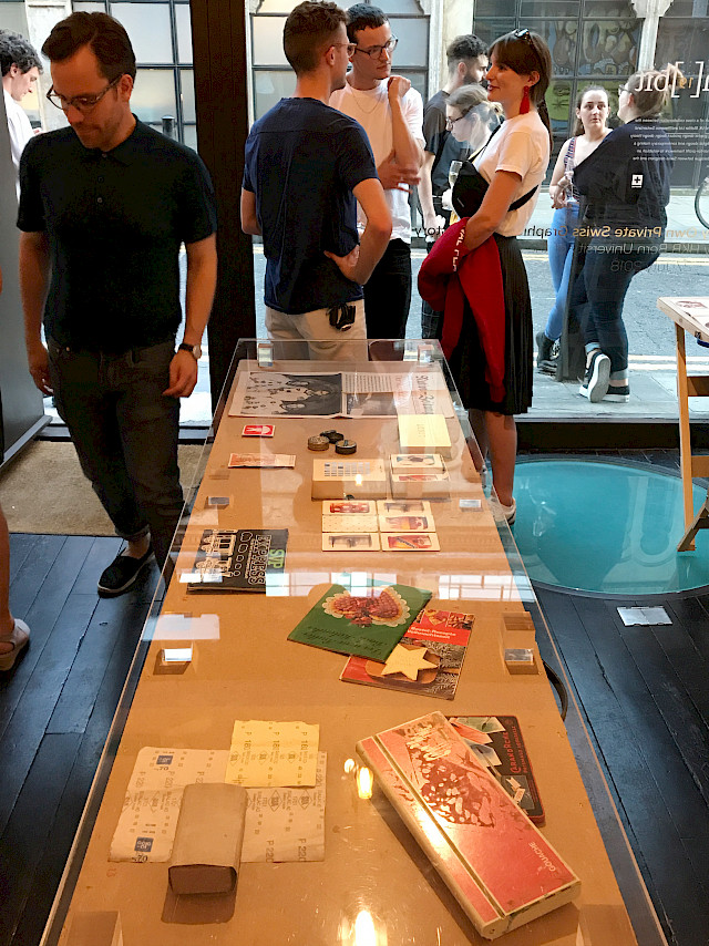
In this sense, the students’ task was to find graphic design objects in their environment that are related to Switzerland. These artifacts – ranging from educational posters to sandpaper – were dis­cussed in class and selected for an exhibition scheduled for the end of the semester. The students conducted historical research on their objects and incorporat­ed their findings into short texts, which offered personal access to Swiss graphic design history and showed the stu­dents’ interest in the individual objects, their form and time, but also a fascination for every­day and amateur design. They represented an un­derstanding of graphic design beyond unique­ness, “author design” and national style. The writing process was supported by Regina Dürig within her sem­inar “Creative Writing” at HKB, and the research was documented on Instagram (#myswiss­graphicdesign).

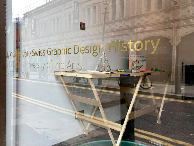
Finally, the students planned, curated and designed an exhibition, intended to present alternative histories of Swiss graphic design and typography beyond the canon and established stereotypes. It was shown at “erlesen – Raum für gedruckte Feinkost” at PROGR, Bern (9–30 June 2018) [http://www.erlesen.org] and at “umlaut¨ gallery space” in London (6–27 July 2018) [http://www.ambit.design/event19.html] supported by the Swiss Cultural Fund UK. Without claiming completeness, the exhibition offered room for diverse interpretations of Swiss graphic design. Furthermore, it contributed to the discus­sion of the mechanisms of historiography, the construction of national identity and the diverse social effects of graphic design practice.

Experts' Panel Meeting 2018, Saturday 5 May 2018

Unesco Intangible Cultural Heritage and Keynote of Jeremy Aynsley

As a logical supplement to the SGDTR-Experts’ Panel Meeting, Dr David Vitali and Julien Vuilleumier from the Federal Office of Culture FOC presented the Swiss implementation of UNESCO Intangible Cultural Heritage. Since October 2017 Swiss Graphic Design and Typography is featured on the national list of Intangible Cultural Heritage ICH. In their presentation Vitali and Vuilleumier explained the responsibilities of the UNESCO/FOC towards the listed traditions and how the nomination and selection process takes place.

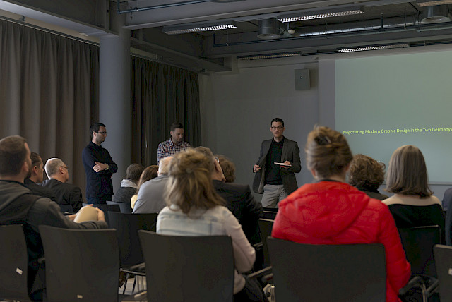
Last, but certainly not least Prof. Dr Jeremy Aynsley, provided the audience with a vivid insight to his current research project. Following the two graphic designers Anton Stankowski and Klaus Wittkugel, Aynsley traced the development of modernism within graphic design of a divided Germany. Despite living and working on either side of the Iron Curtain, Stankowski (West Germany) and Wittkugel (East Germany) had a lot in common. Both had been students with Max Burchartz at Folkwangschule Essen and were therefore trained as modernists. Aynsley demonstrated, how certain designs for different clients and under different circumstances showed a noticeably similar a use of a modernist visual language.

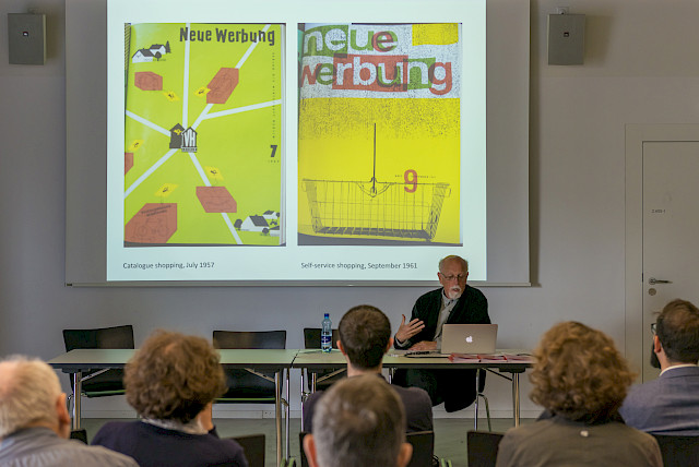
In the second part of his presentation, Aynsley analysed the two trade journals “Gebrauchsgraphik”, which was issued by the Bund Deutscher Gebrauchsgraphiker in West Germany, and “Neue Werbung”, its East German counterpart. While “Gebrauchsgraphik” was an eclectic blend of different topics connected to international graphic design, similar to the Switzerland-based journal “Graphis”, “Neue Werbung” seemed to have been largely used to justify the need of graphic design as a profession in the East. As Aynsley showed, the journals can be considered as having facilitated an exchange between West- and East-German graphic designers. Because of their ephemeral quality they were able to travel on both sides of the Iron Curtain and, to a certain extent, could transfer stylistic influences. Another important means of exchange and possibility for building networks between the two Germanys were design exhibitions on both sides. Certain designers were allowed to travel to the respective venue in order to represent the other side. As a last important player, he identifies globally working associations like Icograda, whose meetings also brought together graphic designers from both sides of the Iron Curtain. It is therefore no surprise that Stankowski and Wittkugel had both been Icograda representatives of their country.

Experts' Panel Meeting 2018, Friday 4 May 2018

Strategies of Dissemination

Friday morning was dedicated to four papers belonging to the strand Strategies of dissemination. The first presentation by Roland Früh, Swissness: National Identity in the making, analysed the development of the national identity through the redesign of Swissair’s corporate identity focussing on three moments: 1952, when Rudolf Bircher won a competition to redesign the logo; 1978, when Karl Gerstner (as part of GGK) proposed an extensive update of the identity; and finally, 2002, when Tyler Brûlé (Winkcreative) oversaw the rebrand of the company as Swiss International Air Lines.

Retracing the actors involved in the various rebrands made visible the specialisation of the trade, with graphic design and advertisement evolving as diverging paths. Furthermore, the lack of discussion led Früh to the conclusion that although from an outside perspective Swissness is perceived as a brand, there is not a similar awareness from inside Switzerland.

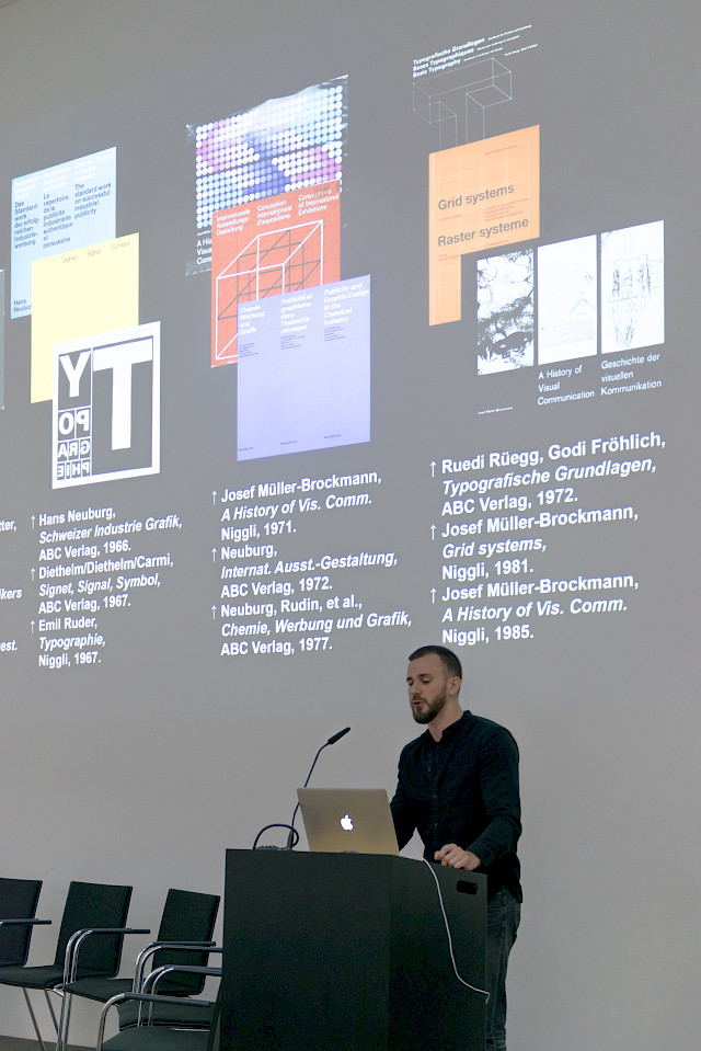
“It all started with Lascaux.” With this strong statement stemming from the opening sequence of Joseph Müller-Brockmann’s History of Visual Communication (1971), Ueli Kaufmann critically analysed modern graphic design narratives which construct the past as progressive development. Self-authored history of graphic design in Switzerland, Karl Gerstner and Markus Kutter’s Neue Graphik (1959), took a positivist approach attempting to show a progression in Swiss design. Despite the claim of continuity made by these books, there are several breaks in the narratives. Furthermore, they tend to evolve from a history of communication to a history of style. Relying on Eric Hobsbawm’s theories dealing with the invention of traditions, Kaufmann questioned the narrative created by the books which ultimately lead to a form of elitism and promote the author’s authority.

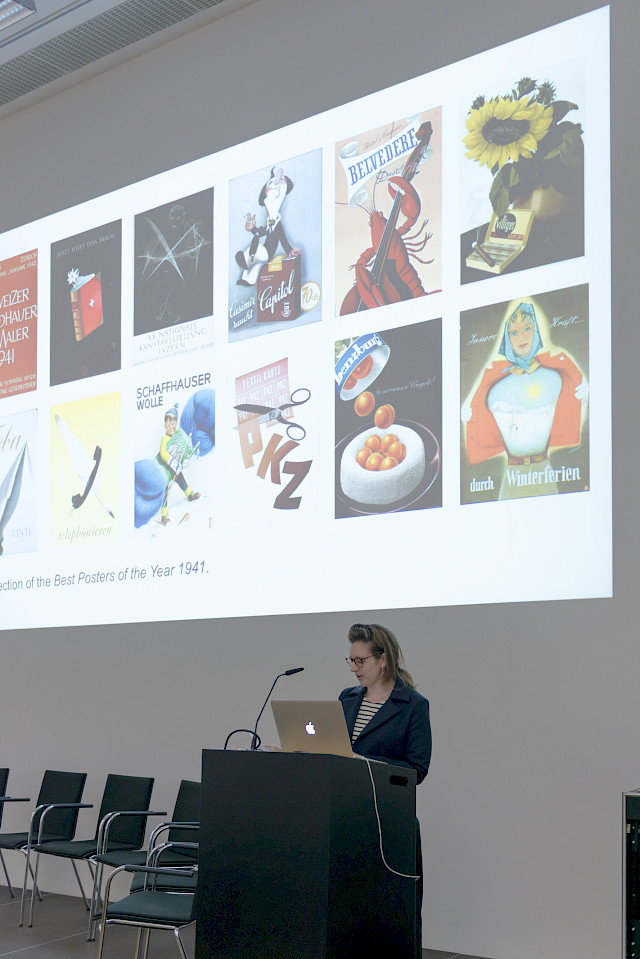
In her presentation, Sara Zeller retraced the history of “The Best Posters of the Year”. The award was started on the initiative of Pierre Bosshard, who attempted to fight back a perceived decline in the quality of posters during the war. Organised by the Federal Department of Home Affairs between 1943 and the late 1990s, the award was initially envisaged as a means to promote the visibility of ‘good’ posters and thus encourage design. In the first years, the poster competition was therefore clearly aimed at the professional community.

However, by the end of the 1940s, the posters increasingly took part in travelling exhibitions that promoted Switzerland abroad. In line with this goal, the travelling posters were not chosen with regards to the quality of their design. Instead, the organisers of the international exhibitions requested posters displaying the best essence of Switzerland such as idealised touristic promotion. The poster award should therefore not only be understood as a means of design promotion but instead be replaced in the wider context of spiritual national defence that contributed to the creation of the image of Switzerland abroad.

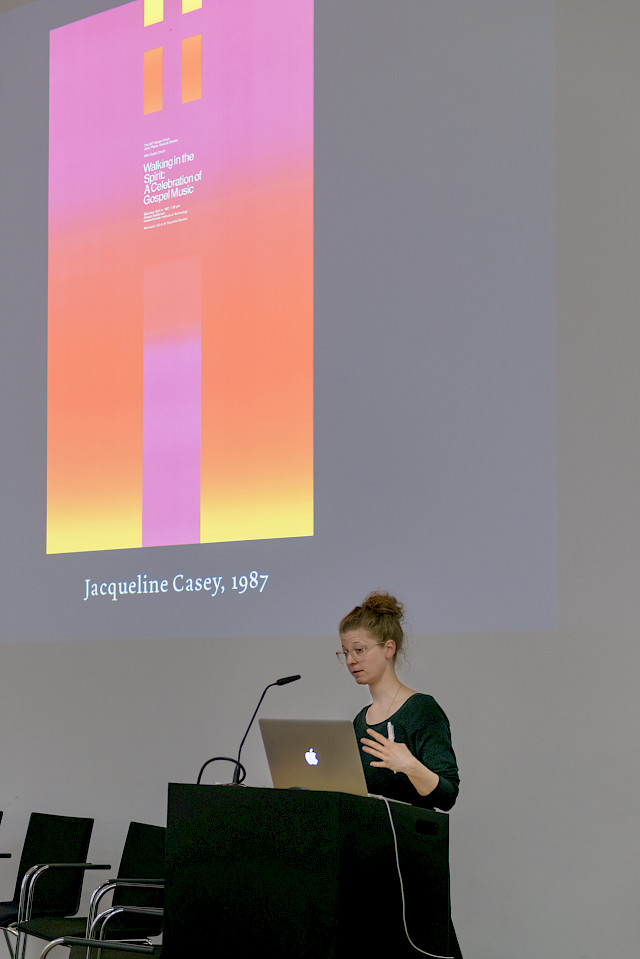
Concluding the morning presentations, associate researcher Julia Meer presented her ongoing publication project centred on the work of Jacqueline Casey and the Massachusetts Institute of Technology’s Office of Publications between the 1950s and the 1980s. The works selected can be connected to broader issues, including gender and the history of technology. Furthermore, the MIT’s publications are a trace of the migration of skills and aesthetics. Julia Meer explained how she aims to connect design and discourse by inviting specialists to contribute to the publication with essays. Furthermore, she highlighted the challenges she is facing as she is confronted with a linear narrative formed around one person and a biased selection of works. Meer thus stressed both her desire to challenge circumscribed perspectives, and her determination to avoid a publication that feels ill-defined due to the many avenues taken by the research.

The morning concluded with a panel discussion which saw the speakers joined by SGDTR experts Jeremy Aynsley and Claude Hauser. As the moderator, Davide Fornari highlighted the role of narrative construction in all the projects, while Claude Hauser highlighted the importance of context and contextualisation. Jeremy Aynsley brought an international perspective by questioning the specificity of Swiss graphic design. He also discussed the discontinuity of modernity, and the role played by conservative modernity, whereby modern means are used to construct a traditional view. Davide Fornari summed up the surprising insights from the morning: exhibition are not necessarily representative of the profession; magazines are not as critical as one would expect; and finally, books are a tool for diplomacy.

Principles of Education

Sub-project A, devoted to principles of design education at arts and crafts schools in Switzerland in the first half of the 20th century, took centre stage in the afternoon during the second day of the SGDTR Experts’ Panel Meeting. In his presentation, Jonas Niedermann discussed the impact on the curriculum of the graphic design course at the Kunstgewerbeschule in Zurich of a Swiss federal law regulating the training in all commercial professions acted in 1939. Based on documents found in the archives of the school, the city, the canton of Zurich, and the professional associations Swiss Werkbund and Verband Schweizer Grafiker, he highlighted the debate these regulations triggered. Whereas the teachers and the professional associations argued that creative processes could not be regulated, the Federal Office for Industry, Trade and Employment encouraged the enforcement of the training regulations in the field of applied arts. In conclusion to his analysis, Jonas showed that Swiss federal law regulating the training in all commercial professions had no significant impact in the Kunstgewerbeschule in Zurich as the Fachklasse Grafik’s curriculum remained unchanged.

Sandra Bischler approached graphic design education from the students’ perspective through the lenses of the students-led magazine K. Produced and published by the students of the Basel Trade School (Allgemeine Gewerbeschule Basel) between 1963 and 1964, the magazine provides a valuable source to identify and explore graphic design principles. Through a close examination of the visual and textual content of three issues, Sandra revealed how the magazines K focused on the formal quality of the document itself instead of the design process and presented a certain aspect of education which slightly contrasted with the curriculum of the school. Thus, she eloquently argued that these magazines can be located as a site from which to explore the relationships between the students and teachers, and used as devices to unlock potential counter narratives.

The third presentation by Peter Vetter focused on the teaching career of Ernst Keller as presented in the first biography No Style. Ernst Keller (1891–1968) – Teacher and Pioneer of the Swiss Style (Triest 2017), which he co-edited. Keller has been referred to as the “father of Swiss Style”, because under his students were a large number of future celebrities of Swiss graphic design. Nevertheless, his actual contribution to design education and training is rarely approached. Departing from this premise, Peter Vetter illustrated the research journey through archives, primary literature and oral history. As conclusion, he questioned his impact on the Swiss Style since he has neither in his teaching nor in his practice fixed himself on a style, but has designed solutions from the content.

Experts’ Panel Meeting 2018, Thursday 3 May 2018

This year’s SGDTR Expert's Panel Meeting took place at the Toni-Areal in Zurich and was opened on Thursday 3 May 2018 with warm greetings by co-applicant Prof. Dr. Sarah Owens—representing the host, Zurich University of the Arts, as well as main applicant and project coordinator Prof. Dr. Arne Scheuermann. Co-coordinators Davide Fornari and Robert Lzicar briefly presented the development of the SGDTR project from the first sketch of ideas to the kick-off in 2016 and gave an introduction to the structure and thematic orientation of the individual sub-projects.

Networks of Practice

The panel's contributions started with sub-project B, which focuses in particular on the research about "Networks of Practice" in graphic design. The first contribution of the day came from PhD candidate Constance Delamadeleine, who presented her research on Studio Hollenstein in Paris (1957–1974). Her analysis of the internal structures of the studio, but also of the connections to other agencies, showed that Studio Hollenstein, in which many Swiss graphic designers worked in the 1960s, already offered a full service based on the model of US-American agencies and presented a strong contrast to the still predominant image of the single graphic artist and his or her studio.

Afterwards, researchers Chiara Barbieri and Davide Fornari presented their work on Milan-based graphic design studio Unidesign and its founder Walter Ballmer, which is based especially on research in the graphic designer’s legacy and on methods of oral history. They raised the question of how the archive could be questioned from a methodological aspect and how to approach the fact that archives are always constructed.

In the third contribution, PhD candidate Jonas Berthod analysed the working culture of three Swiss graphic studios at the beginning of the 2000s by comparing: Megi Zumstein, Gilles Gavillet and NORM. He analyzed their intentions, revealed the development in their self-promotion and noted that the commercial aspect increasingly receded in favor of gaining cultural capital.

Finally associate researcher Tania Messell from the University of Brighton presented outcomes from her PhD project on the International Council of Societies of Industrial Design (ICSID), its program, development and impact. She emphasized in particular that studies focusing on networks should go beyond national borders and take transnational activities into account—a clear argument in favor of continuing to expand international cooperation with researchers.

The lectures were followed by a one-hour panel discussion with all the speakers and SGDTR expert Teal Triggs, design historian and Professor at Royal College of Art London. The panel initially focused on clarifying still open methodological questions and theoretical frameworks. Triggs recommends to the researchers to focus on visual material as the starting point for historical research and to think about how their practitioner's perspective can contribute to their research?

Annual Research Team Meeting 2017

On 1 December 2017, the SGDTR research team and associate researchers met in Bern for the annual research team meeting. On this occasion, each sub-project was asked to submit an abstract for a research paper, which was then reviewed by the core scientific group in advance. Valuable feedback to this abstract, given by the reviewers, helped to clarify and refine the final paper’s focus. The aim of such a call for papers procedure can be seen as a rehearsal for future contributions of the research team to conferences and symposia related to the project's case studies.

Beginning in the morning with presentations of the further elaborated papers, prepared by each of the sub-project researchers, every contribution was followed by critical but constructive questions and remarks from the attendees with regard to research questions, methodologies and further steps of the project.

Starting with sub-project A dedicated to principles of education, Jonas Niedermann presented a paper which meticulously analysed three specific periods from the chronicle of the Fachklasse Grafik’s curriculum at the Kunstgewerbeschule Zürich (KGSZ) from 1920 to 1970. In the second paper, Sandra Bischler focused on the conversion of pedagogical concepts in the 1930s at the Kunstgewerbeschule Basel, due to implementation of new subjects to the curriculum and recruitment of new teaching staff as for example Theo Ballmer or Karl Becker. Finally, Sarah Klein, who originally focused on the rise of the profession of graphic designer based on the archives of Hermann Eidenbenz, shifted the topic of her research to basic exercises in graphic design education in Switzerland in the 20th Century.

In the second session, Constance Delamadeleine of sub-project B has changed her case study from Werner Jecker and Jean Widmer to «Dealing with the «Swiss Style» at the Studio Hollenstein». Furthermore, Chiara Barbieri and Davide Fornari presented a self-critical paper about using archival research and oral history methods in order to uncover Unidesign: a Swiss design agency in Milan. In the third case study of sub-project B, Jonas Berthod examined the Swiss graphic design network by means of the two role models NORM and Gilles Gavillet and raised the question about the influence of such relationships on Swiss graphic design.

Finally, the research team of sub-project C (dedicated to strategies of dissemination) outlined a new method to approach their case studies. By means of keywords, as they are used in dictionaries or encyclopaedias, they attempted to pinpoint essential or interesting parts of each case study. With the keyword «cool» Roland Früh tried to address and examine relevant magazines’ language. The word «hand» stands for Ueli Kaufmann's examination on the renegotiation of crafts and technology within Swiss graphic designers’ book and last but not least the word «frame» was used by Sara Zeller to analyse the impact of a frame on the perception of Swiss Graphic Design within a exhibition context.

The sessions by the sub-projects were followed by a discussion about potential publication strategies for the research project. Each sub-project presented a few ideas on publication tables, which were later discussed by the whole research team. Digital publications, where all sub-projects and case studies might be connected, or a concept of a reference book working with keywords were proposed and outlined. In the end, all research team members agreed to continue and deepen this discussion in a following meeting.

Exhibition and Symposium "Practices in Design Education – Hundred Years Kurt Wirth 1917-2017"

Initiated by SGDTR's associate researcher Leslie Kennedy with the curatorial assistance of Moreno Tuttobene, an exhibition (running from November 2 until November 30, 2017) and a symposium (held on November 17, 2017) highlighting the educational and professional activities of the Swiss graphic designer Kurt Wirth (1917–1996), were organized at the FHNW HGK Basel.

Both events represented a reflection on Wirth's contribution to the history of graphic design education and to honour his 100th anniversary. Sandra Bischler, Sarah Klein and Michael Renner, researchers of the SGDTR subproject "principles of education", contributed to the symposium by providing insights into their research and contextualizing Wirth within the design education landscape of Switzerland and abroad.

By contrasting Wirth's educational approach with developing practices in graphic design, as well as, the educational methods of his contemporaries, his legacy becomes relevant to SGDTR's research enquiries. The events provided us with valuable insight into his uncompromising emphasis on drawing as the foundation of all design processes, as well as, his employment of the master-apprentice model of education as the alternative course to a full time program at schools of applied arts.

Along with historical reflections on graphic design education, the symposium included a biographical outline, Wirth's lasting influence on contemporary practice, as well as, more general reflections on the context of Wirth's time as a designer, such as the role of women in graphic design history.

Among the speakers were Stephan Bundi, Sandra Bischler, Sarah Klein, Jenny Leibundgut, Julia Meer, Michael Renner, Moreno Tuttobene, as well as a panel discussion with Simon Wirth.

Links:

https://www.fhnw.ch/de/die-fhnw/hochschulen/hgk/institute/institut-visuelle-kommunikation/exhibition-and-symposium-practices-in-design-education-hundred-years-kurt-wirth-1917-2017/program_symposium_kurt_wirth.pdf

​​​​​​​https://www.fhnw.ch/de/die-fhnw/hochschulen/hgk/institute/institut-visuelle-kommunikation/exhibition-and-symposium-practices-in-design-education-hundred-years-kurt-wirth-1917-2017

Swiss Graphic Design: a British invention?

Graphic design and typography from Switzerland have always been under close inspection by practitioners in Great Britain. The role of these connections in spreading the brand Swiss Graphic Design across the English-speaking countries is obvious. The question could even be posed whether the phenomena of Swiss Graphic Design is as much an English invention as a Swiss self-definition.

Jan Tschichold had been called by Ruari McLean to design for Penguin from 1947 to 1949. The English typographer Anthony Froshaug had been corresponding with Max Bill. Richard Hollis had invited Emil Ruder to teach in Bristol at around 1964. Herbert Spencer named his daughter Mafalda after the wife of Rudolf Hostettler. The first issue of Eye magazine included an extensive interview with Bruno Monguzzi. And until recently the only available texts addressing the phenomenon of a specific typography and graphic design from Switzerland had been primarily described by British practitioners and writers. Robin Kinross included a chapter on ‘Swiss typography’ in his 1992 book Modern typography and Richard Hollis published a rich overview in 2006 titled Swiss Graphic Design. The Origins and Growth of an International Style. The role of these connections in spreading the brand Swiss Graphic Design across the English-speaking countries is obvious. The question could even be posed whether the phenomena of Swiss Graphic Design is as much an English invention as a Swiss self-definition – just as the Alps as a hiking and tourist paradise originally was a concept thought out by British adventure seekers.

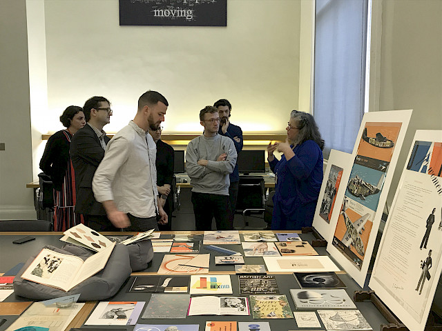
The researchers of sub-project C, which focuses on the dissemination of Swiss Graphic Design through journals, publications and exhibitions, took to a first-hand inquiry and spent one week (17 – 22 October 2017) in London to meet and exchange with critics, researchers, archivists and designers. After all, the discipline of Design History and Graphic Design History, in particular, has a much more established form in the United Kingdom than in Switzerland. The conversations circulated around questions such as: How much did British practitioners and experts help to define and disseminate the label of Swiss Graphic Design? (Very much.) Through which channels did they learn about design from Switzerland and how influential were exhibitions (not so much), journals and publications (very much) in that respect? And how were the networks established between designers in the UK and on the continent? (The Grand Tour of British graphic designers through Switzerland deserves special mention.) How did graphic design evolve as a discipline in the UK and how was the industry involved in education?

These and other questions were discussed with design curator and historian Emily King, graphic designer and historian Richard Hollis, Richard Doust (senior tutor at RCA School of Communication), Jeremy Ainsley (professor for Design History at University of Brighton and Chair of the Design History Society), the editorial team of Eye magazine, Catherine Ince (senior curator at V&A Design and Architecture), printing historian James Mosley, David Beck (Head of Culture at the Embassy of Switzerland in the United Kingdom), graphic designer John Morgan, and Michael Twyman, Eric Kindel, Gerry Leonidas, Christopher Burke, professors and researchers at the Department of Typography and Graphic Communication at University of Reading. Thank you for this inspiring and insightful week!

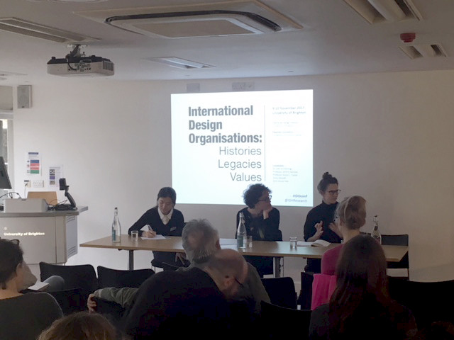
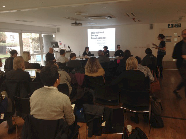
Italian emancipation and Swiss adaption: SGDTR members’ contribution to conference “International Design Organisations: Histories Legacies Values”, University of Brighton

The conference “International Design Organisations: Histories Legacies Values” taking place at the University of Brighton on 9–10 November 2017 invited researchers to contribute and open up multiple perspectives on the role of design organisations within and beyond the history of design. With contributions by international scholars – coming from universities in the US, Turkey, Estonia, Colombia, Brazil, Switzerland and the UK – committing their research to various topics in the history of design throughout the 20th and 21st century, the conference provided insights to the subject on a global scale.

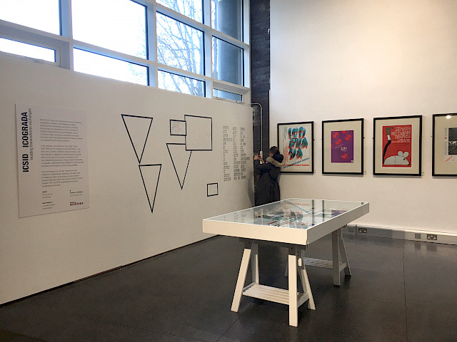
International design organizations have been powerful organs promoting and fostering the professional establishment of the discipline all over the world, and have therefore also largely contributed to the history of design. However, “histories, legacies and values” of international design organizations are still an under-researched topic and hold a marginal position in the academic literature. With two PhD candidates at the University of Brighton Tania Messell (SGDTR associate researcher) and Dora Souza Dias committing their PhD-thesis to ICSID and ICOGRADA (now Ico-D) respectively international design organizations are finally put in the spotlight of academic scrutiny.

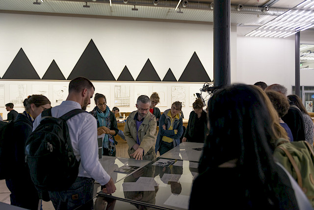
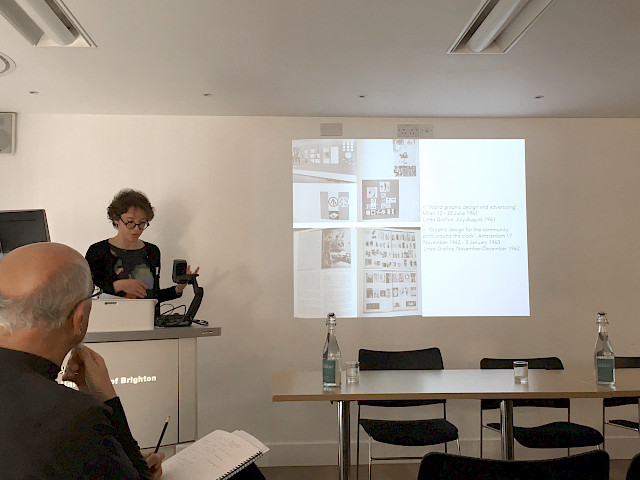
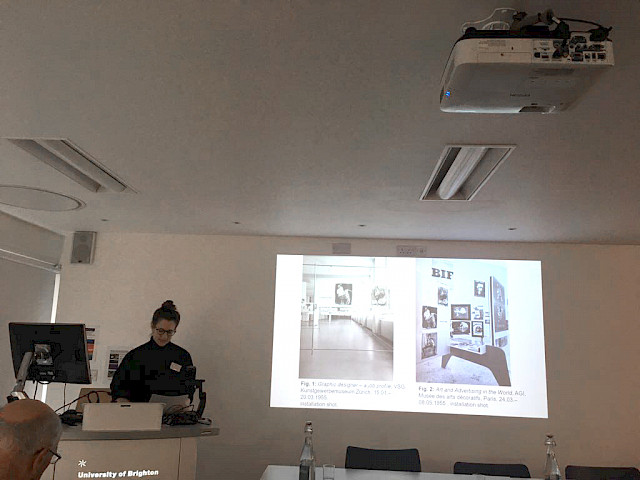
As a matter of fact, design organizations are also of great interest to SGDTR-researchers. In her presentation – “The exhibition as a tool: Design association’s influence on the international perception of ‘Swiss graphic design’” – Sara Zeller (PhD-researcher in sub-project C “Strategies of Dissemination”) analyzed, how the Swiss graphic design association Verband Schweizerischer Grafiker (VSG) and the Alliance Graphique Internationale (AGI) used exhibitions as a tool to disseminate their social, cultural and political agendas and what impact those exhibitions could have had on the dissemination of “Swiss Graphic Design”. During the first half of 1955, almost at the same time, both the VSG and the AGI opened a major exhibition reaching an international audience: “Grafiker – ein Berufsbild” (Graphic designer – a job profile organised by the VSG took place at the Kunstgewerbemuseum Zürich (today Museum für Gestaltung); “Art et publicité dans le monde” (Art and advertising in the world), overseen by AGI, was hosted by the Musée des arts décoratifs in Paris. Even though the Swiss VSG and the international AGI have rather different histories and goals, interestingly, several VSG-members were also part of AGI and therefore represented in both exhibitions. The simultaneity of these exhibitions, their international claim, and the members-overlaps were intriguing arguments to take the conference as an opportunity to look deeper into the subject. The analysis showed that the national VSG and the international AGI had an influence on how Swiss graphic design was perceived at the time and also seemed to have fostered the canonization of certain designers and objects. Nevertheless, its actual extent has to be further questioned.

Chiara Barbieri’s (postdoc researcher, sub-project B “Networks of Practice”) presentation – “The poor relatives of industrial design: Shaping Italian graphic designers’ identity between national and international design organisation in the 1960s” – discussed the strategies adopted by graphic designers to emancipate themselves from advertising and access the design domain as the equal partners with industrial designers. To this end, the presentation explored the relationship between the Italian Association for Industrial Design (ADI) and the Italian Association of Advertising Artists (AIAP). Zooming out from the local scene, it contextualized the micro narrative of Italian graphic design within a macro narrative and explored the interaction between the two scales. This macro narrative involved international organizations and other platforms of transnational exchange and addressed the articulation of a new thinking in visual communication in the 1960s.

The two-day conference showed that design organizations played a vital role in how a certain country or designer has been perceived on a national but also international level. When it comes to the subject of design organizations and associations, it provided to be most fruitful to compare the developments of the different countries, taking their varied political situations into account, too. The many lively debates, which arose out of the two-day conference, have shown that the discussion about international design organizations on an academic level has only just begun.

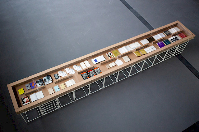
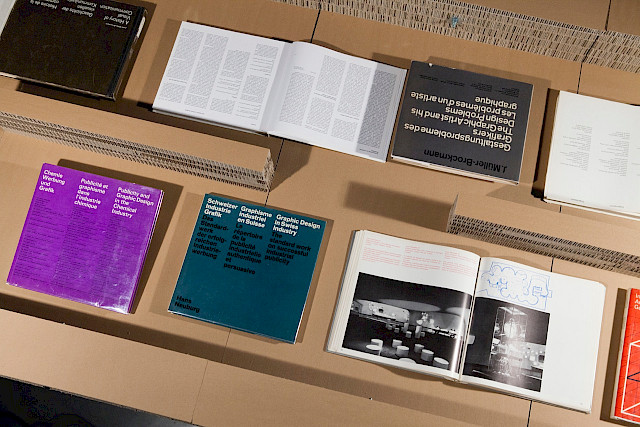
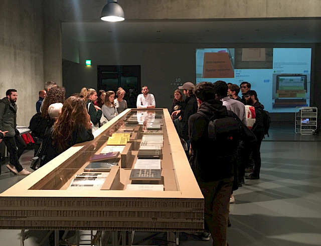
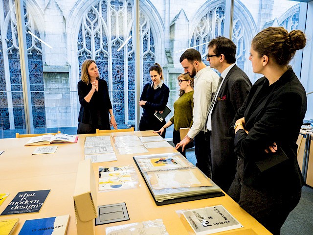
Milch – Lait – Latte. An exhibition on iconic Swiss graphic design manuals setting a multilingual standard

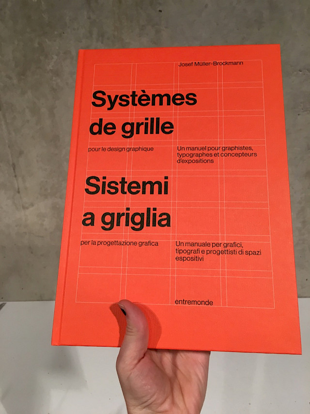
From September 22, to October 1st, 2017 the researchers of sub-project C set up an exhibition accompanying the launch of the bilingual (French and Italian) translation of Josef Müller-Brockmann’s book Grid systems in graphic design, published by Editions Entremonde. The event took place at Espace Hippomène, the new building of HEAD Geneva. Sub-project C focuses on the dissemination of Swiss graphic design through journals, publications and exhibitions and the aspect of multilinguality proves to be one of the key factors in it.

Josef Müller-Brockmann’s book Grid systems in graphic design is probably the best known manual by a Swiss graphic designer. First published by Niggli Verlag in 1981 it has been reprinted in its original bilingual version in English and German several times and was translated into Spanish, Portuguese, Korean editions, just to name a few. However popular the book, it has never been published in French or Italian thus far – a gap which Editions Entremonde, a young publishing venture from Paris and Geneva, has now filled. The reason – they say – is to make this text available to students in Italian and French-speaking countries, so they can read Müller-Brockmanns text in their first language and expose it to a more substantial critical reflection.

The title Milch – Lait – Latte is a reference to growing up in Switzerland where it is very common to have childhood memories of sitting at the kitchen table in the early morning, still half asleep munching cereal, deciphering all sorts of packaging information and labels in three languages. Milch – Lait – Latte thus became the tagline and serves as reference to the symptom of the ubiquity of translations in Switzerland.

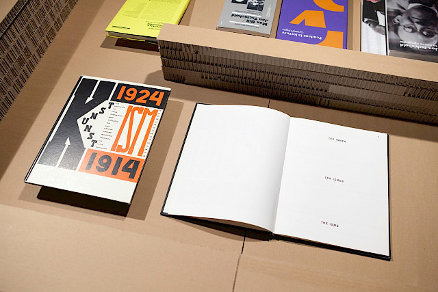
The exhibition is compiled of different groups of books, each referring to one possible strategy of translations. It starts with El Lissitzky and Hans Arp’s book Kunstism from 1925 which was published in French, German and English and already aimed at an international audience. Kunstism could be seen as an early model for trilingual publications. Especially for those who later became iconic for the label Swiss graphic design, such as Karl Gerstner and Markus Kutters Die neue Graphik, published by Niggli in 1959 or its contemporaries, the books by ABC Verlag Zürich. Hans Neuburg realised several books with this antsy publisher, keeping to the format of portfolio-books and propagating good work in fields such as exhibition design, design for industry or design for chemical industry in particular. The layout of the books was often arranged by graphic designer Walter Bangerter and became known for the notorious use of three columns for the three languages.

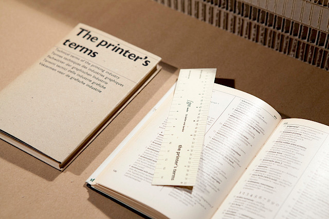
The exhibition also included lesser known publications, such as the ambitious translation project of Rudolf Hostettler The printer’s terms. Published first in 1949 it was a modest, small booklet listing translations of terms of the printing industry in four and sometimes more languages. A handy tool for everyone working with the international printing industry. On display were also other publications by Josef Müller-Brockmann in different editions and the small booklet by Jost Hochuli Detail in typography, which is still in print and has been translated into more than 10 languages. Then, as most recent books were shown the publishing projects of Spanish publisher Campgràfic Editors, the Paris based Editions B42 and Editions Entremonde, to close the circle.

Additionally a projection of images taken from the web and social media featuring Josef Müller-Brockmann’s Rastersysteme is an ode to the congenial, slightly cultish approval of the book worldwide.

A contribution by Roland Früh, Ueli Kaufmann, Sara Zeller and Robert Lzicar (members of the SNSF–research project Swiss Graphic Design and Typography Revisited)

With the generous advice and book loans of Editions Entremonde, Lena Koop, Nina Paim, Felix Wiedler, Kunstbibliothek Sitterwerk, Campgràfic, and Jost Hochuli.

See full bibliography below:
http://sgdtr.ch/site/assets/files/1154/sgdtr-wrtj68.pdf

Demystifying the Avantgarde and the PhD-thesis

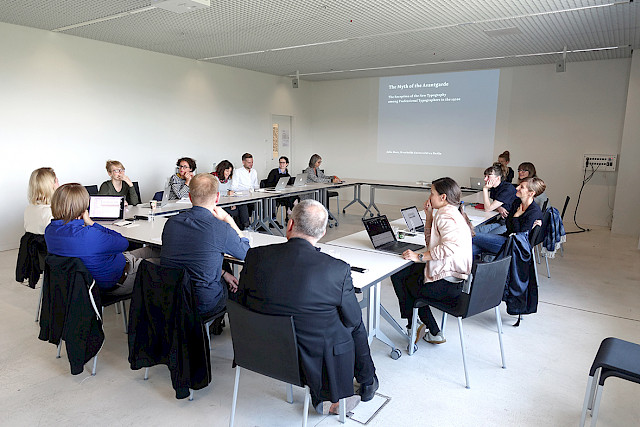
On 12 September 2017 Dr. Julia Meer presented her PhD-project during the entertaining lecture “The myth of the Avantgarde – The reception of the New Typography among Professional Typographers in the 1920s.” In her research, Meer deconstructs the established version of an important part of graphic design history by closely observing the sources and reevaluating texts by modernist typographers such as Tschichold, Moholy-Nagy and others within their historical context and comparing them with articles from professional journals of the time.

Some of her other projects include “Women in Graphic design 1980–2012” (together with Gerda Breuer, 2012) and “Leuchtende Illusion – Die Bauhaus-Leuchte” (a short movie about the myth of the Bauhaus lamp, 2015).

In her thesis “Neuer Blick auf die Neue Typographie: Die Rezeption der Avantgarde in der Fachwelt der 1920er Jahre” (New perspectives on the New Typography: The reception of the avant-garde in professional circles in the 1920s) Meer takes a closer look at the established view on how the “Neue Typographie” (New Typography) was established in the discourse. Looking at the discussion on the “Neue Typographie” in professional journals of the time, she soon found that there is a gap between the analysed material and the often retold narrative of modern graphic design history. Meer proved, that the whole story is not so much about a battle between modernists against shocked conservatives as it is about the history of the professionalization in the field of graphic design.

Meer distinguishes three groups of professional graphic designers in 1920s-Germany: The “Buchdrucker” (printers), “Gebrauchsgrafiker” (the graphic artists) and the “Reklamefachleute” (advertisers). Each group had their own association and pursued their own interests.

At that point of the lecture she stopped and addressed the audience: “Who do you think supported the ‘Neue Typographie’ the most?” Her own hypothesis, that the graphic artists had fostered the “Neue Typographie”, proved to be wrong. According to Meer, the leading proponents of the “Neue Typographie” were printers. Attempting to stay competitive in the market they tried to ban the graphic artist’s area of expertise, like for example drawing and hand lettering.

During her presentation, Meer not only talked about the outcomes of her PhD-thesis but provided also a glimpse into her struggles during conducting the research, for example constantly having to formulate research questions, restructuring and newly organizing previous writings.

SGDTR members contributed to GfDg annual conference in Offenbach

Sandra Bischler and Sarah Klein, researchers and Ph.D. candidates within the SGDTR sub-project A (Principles of Education), took part in the 10th conference of the Gesellschaft für Designgeschichte (GfDg), taking place at the University of Art and Design (HfG) Offenbach am Main on 19–20 May 2017. The thematic focus on “Designkritik” (design criticism) was set, due to a considered launch of a new master program in design criticism and design curating at the HfG Offenbach. SGDTR members were invited to contribute to the conference by presenting their intermediate research results and the intersections with design criticism.

In the opening address, it was commented, that design historian Gert Selle had remarked on the choice of the topic, as being perhaps, the most challenging subject of all GfDg conferences held to-date. Indeed, the subject attracted an heterogeneous group of people reflected in both the speakers and the audience. Practical fields of design such as architecture, industrial design, and graphic design were represented, as well as, theoretical fields of art history and theory, philosophy and design history. Design and design history educators were present, as well as, students, curators, and not least, critics.

The contribution of Sandra Bischler and Sarah Klein was the first report on their research to-date, dealing with graphic design education in Switzerland. While the connections to design criticism seemed vague, at first sight, investigating possible intersections provided a vehicle to reflect on the intermediate results of the research, from a different perspective. The aspect of criticism within and on graphic design education opens new fields of questions and possible ways to approach the topic. In this respect, the conference was a broadening opportunity to exchange knowledge and inspiration beyond the project’s borders.

The ensuing Q&A session pointed out one particular challenge, when it comes to the history of design education: Myths and stylistic attributions that have been built around famous design schools (also by design criticism itself) are often quite resistant to historian’s undertakings of revisiting – e.g. the Bauhaus-myth. Dealing with these myths and their persistence, will be essential for further research on Swiss graphic design in general and for Subproject A in particular.

Throughout the two days of the conference, a wide range of questions concerning design criticism was addressed. The discussions between the lectures were lively, sometimes even emotionally charged. The (self-)criticism towards design criticism was ubiquitous. Several speakers pointed out that design journalism, especially online, is currently acting more and more affirmatively towards design – often lacking a political or social perspective or simply paraphrasing corporate press releases instead of seriously reviewing design. When it comes to the use of images, product shots are often reused instead of developing an original visual approach towards the object. At the same time, it was made clear that working conditions for design critics, if not linked to an industry, are often precarious. Further deficiencies discussed were the noticeable absence of design criticism in newspaper feuilletons in comparison to film, literature, and theater criticism.

From a general perspective, there were discussions about how broadly the term design criticism should be understood. Is it mainly about judging design in written form or could there be more to it, e.g. using photography or even design practices themselves? Are there limits to what can function as design criticism? The wide range of lecturers and broad spectrum of issues addressed seems to speak for itself. Despite the concerns about design criticism, the overall atmosphere, at the end of the conference, was positive, and a zest for action was in the air.

© Wolfgang Seibt
© Wolfgang Seibt

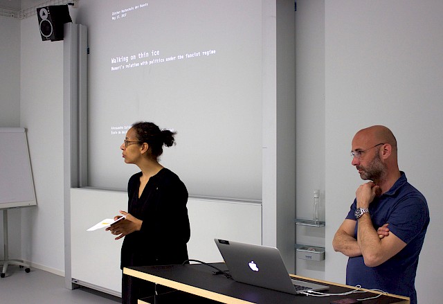
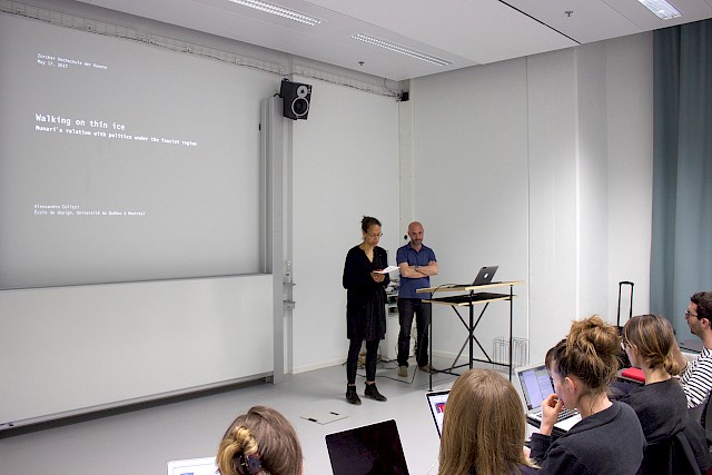
Walking on Thin Ice: the Relation Between Bruno Munari and Fascist Regime

On 17 May 2017, professor Alessandro Colizzi from Université du Québec à Montréal (UQAM) gave a lecture in the framework of the ongoing series of lectures organized as part of SGDTR by all participating universities, upon the invitation of Zurich University of the Arts (ZHdK). The lecture focused on the relations between Bruno Munari and Italian fascist regime in the 1930s and 1940s as part of his current studies on the birth of Modernism in Italian graphic design.

The relationship between Italian Fascism and architecture, fine arts and visual culture has been extensively studied by scholars. Alas, the same cannot be said for the role played by Italian graphic designers in the construction and mediation of the fascist regime. This remains a taboo topic that few design historians have been willing to address so far. Colizzi is among those graphic design historians who have begun to critically approach the pragmatic and/or ideological attitude of graphic designers towards the Italian Fascism. During his lecture, Colizzi addressed the integration of modernism imagery and techniques into the official culture under the fascist regime through the interwar work of Bruno Munari (1907–1998). In doing so, he shed new light on Munari’s early career, and presented a different image of the Italian graphic and product designer, visual artist and design pedagogue.

Born in 1907, Munari was part of the first generation of self-taught Italian graphic designers. He moved to Milan in the mid-1920s to become an artist. Soon after, he became involved in the Futurist art movement, sharing with the second generation of futurists an interest towards applied and commercial arts. In 1931, he co-founded, together with Riccardo Castagnedi, the advertising and graphic arts studio Ricas + Munari. In 1939, the Milanese publisher Mondadori hired him as art director. There, Munari was put in charge of the illustrated press, in particular the magazines Grazia and Tempo.

Colizzi’s selection of Munari’s interwar graphic output provided evidence of the ways in which he was able to adapt his visual language according to circumstances, patronage and purposes. Since this very early stage, Munari’s work featured a humorous vein and a tendency to experiment with different media and visual languages. On the one hand, he adopted a surreal humour that was close to Metaphysics and surrealist nonsense. For instance, the illustrations and graphic compositions published in the magazines L’Almanacco Letterario Bompiani and La Lettura exemplify Munari’s experimental use of photography, collage and photomontage that put his work in direct contact with avant-garde aesthetics, Constructivism, Dada and Surrealism in particular. On the other hand, Munari adopted a more conservative approach to visual communication, featuring a painterly language that was close to the one advocated by exponents of the Novecento movement. This was in particular the case with works echoing the rhetoric of political propaganda such as the covers he designed for the magazines La Rivista Illustrata del Popolo d’Italia – the monthly illustrated supplement of the official newspaper of the Fascist National Party – and Ala d’Italia.

Munari’s works connected with propaganda are not numerous and, according to Colizzi, not all of them are sensational. Nevertheless, their very presence cast a shadow over the designer. In some cases, one can try to analyse and appreciate the form regardless to the controversial content. For instance, Munari’s work as art director of the illustrated magazine Tempo resulted in a visually compelling publication, featuring pioneering use of photojournalism and infographics. Italian response to the American magazine Life with whom it shared some formal similarities especially regarding the cover layout, Tempo played a key propagandistic role within and beyond national borders.
As argued by Colizzi, Munari’s apolitical stance enabled him to operate within the limits and/or opportunities of political establishment, maintaining a certain degree of independence. In the post-war period Munari pragmatically repositioned himself and never spoke about his interwar work. By contrast to the general tendency of historians of Italian graphic design to avoid the shadowy relationship between graphic design and Italian Fascism, Colizzi’s research on Munari’s interwar works overcomes scholars’ discomfort and reluctance to admit that major figures of Italian graphic design produced works that were used as vehicles of political propaganda. At the same time, it goes beyond the simplistic ‘good vs. bad’ viewpoint and addresses the grey area between alignment and resistance in the belief that the complexity of the relationship between professionals and intellectuals and the Fascist regime cannot be reduced to a mere dichotomy between fascism and anti-fascism. Thus, Colizzi’s work demonstrates that the time is finally ripe to critically address a highly problematic period of Italian graphic design.

When History and Rhetoric meet: Two Lectures devoted to Methodology and Theory

On 10 March 2017, the SGDTR research team and associate members were invited to Bern for a lecture session devoted to methodology and theory. For this occasion Dr Monika Dommann (Professor of Modern History at the University of Zurich) and Dr Oliver Lubrich (Professor of German and Comparative Literature at the University of Bern) were invited to present an introduction to their disciplines and providing some sound advice and guidance.

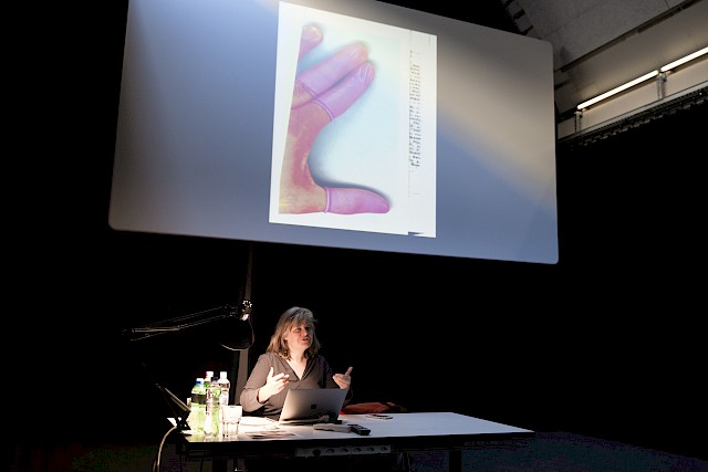
“What is history in the making?” was the title of Dr Dommann’s talk dealing with the practice of history. She built her presentation around the two main questions, “what do historians do?” and “what did you learn from history?”. She started her presentation by giving an example of an advertisement portraying a pedoscope in a Bally shoe store, a device that was widely installed in Swiss shoe shops at the beginning of the 1960s to help sell shoes. The popularity of the pedoscope reflected the fascination that X-rays held for the public. She asked, “How were X-ray images perceived?”. According to her, the human sense of sight became more important than the other senses. Through this example, she was looking to stress the importance of paying great attention to details in visual artifacts, their dissemination and the context in which they appeared.

Despite the flexibility the discipline may endorse, there is one important goal to fulfill when doing history, namely, to reveal the truth. “Historians are truth seekers,” she asserted. During her talk, she mentioned several seminal publications, such as March Bloch’s “Apologie pour l’histoire ou métier d'historien” (1949), Hayden White’s “Tropics of Discourse: Essays in Cultural Criticism” (1978), and others.

Throughout her talk, Dr Dommann mentioned useful recommendations which design, historians should keep in mind over the next three years, i.e. look at the margins, be critical, be original, don’t believe what you read, keep in mind there is no absolute truth! Pay attention to tiny details, reference your argument, and write simply!

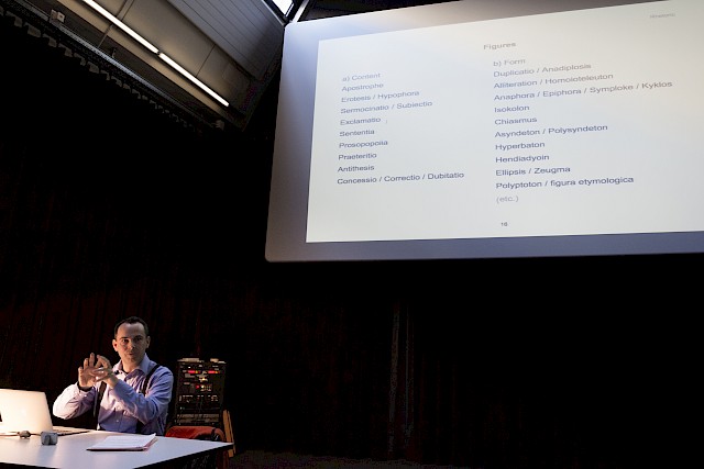
During the second lecture, Dr Lubrich offered an introduction to rhetoric. First, he explained why rhetoric can make speech effective and forceful and presented the five canons of rhetoric: invention, arrangement, style, memory and delivery.

Working with neuroscientists Dr Lubrich conducted studies in experimental rhetoric, on the effects of figurality in political speeches such as, to what extent does the impact of language depend on formal qualities of rhetorical elaboration? Taking 5000 words from Barack Obama’s acceptance speech as an example, they identified 250 formal rhetorical figures. By “de-activating” hundreds of figures in a single text and without affecting its imagery or semantics, they compared the degree by which these figures enhance the effects on the audience with the result that figures have persuasive, affective and aesthetic effects on the reader.

Dr Lubrich closed his presentation with a short introduction to visual rhetoric. Referring to Dr Arne Scheuermann, the rhetoric can be used to research into design by metaphor or verbal images. Speakers use verbal images to create a more lively impression, which is more effective in terms of memorability. “We understand the world in terms of metaphor,” Dr Lubrich concluded.

The morning ended with a Q and A session, moderated by Dr Davide Fornari and Robert Lzicar that sparked a brief but interesting debate triggered by Dr Peter J. Schneemann, coordinator of sub-project C, asking: How can we combine these two contributions in term of recent developments in historiography? And, how can we use self-consciousness arguments in our narrative? A discussion that indeed deserves to be pursued further.

"Mapping Graphic Design History in Switzerland" toured the US

On invitation by swissnex Boston, Davide Fornari and Robert Lzicar presented the book “Mapping Graphic Design History in Switzerland” they co-edited at four venues in the United States. The tour was supported by the Consulate General of Switzerland in New York, Bern University of the Arts, and ECAL University of Art and Design in Lausanne, SDN Swiss Design Network, and managed by Cécile Vulliemin of swissnex Boston.

The book presentations were also a chance to disseminate the research project “Swiss Graphic Design and Typography Revisited” to a broad audience of design educators, academic scholars and designers.

At Chicago Design Museum, the editors discussed the making of the book and the impact of graphic design education models elaborated in Switzerland with Philip Burton, Marcia Lausen and Jonathan Mekinda (all professors of the School of Design, University of Illinois at Chicago) together with Professor Emeritus Victor Margolin, who praised the follow-up project as a model for elaborating design research today.

The School of the Arts at Yale University in New Haven hosted a book presentation along with the papers “Swiss Style Made in Italy: Graphic Design Across the Border” by Davide Fornari and “Designed Histories: Visual Historiography and Canonization in Swiss Graphic Design History” by Robert Lzicar within the course of Sheila Lavrant de Bretteville (Professor and Director of Graduate Studies in Graphic Design) and Julian Bittiner (Senior Critic).

Alexander Tochilovsky (curator of the Herb Lubalin Study Center of Design and Typography at the Cooper Union) introduced the debate at Cooper Union’s Frederick P. Rose Auditorium in New York City, engaging Juliette Cezzar (Assistant Professor of Communication Design at the New School’s Parsons School of Design), James Goggin (Assistant Professor of Graphic Design at the Rhode Island School of Design) and Lucille Tenazas (Professor of Communication Design at the New School’s Parsons School of Design) on the status of graphic design as a discipline both in the US and in Switzerland.

Finally, swissnex Boston, the Swiss science consulate in Cambridge (MA), hosted the last conversation featuring the editors and Elizabeth Resnick (Professor and former chair of Graphic Design at Massachusetts College of Art and Design), curator of recent poster exhibitions on human rights and citizens’ engagement.
In summary, all people and parties involved highlighted the relevance of both initiatives, “Mapping Graphic Design History in Switzerland” and “Swiss Graphic Design and Typography Revisited”, for the international discourse on graphic design history, as well as their collaborative and integrative approach as models for its academic future.

First SGDTR Experts’ Panel Meeting

On 10 February 2017, the SGDTR research team met up at the Grosse Aula at the Bern University of the Arts to present and discuss the state of the research and intermediary results to a panel of experts including Teal Triggs (Associate Dean and Professor of Graphic Design at the Royal College of Art) and Claude Hauser (Professor of Contemporary History at the University of Fribourg) as well as to the recently appointed associate members of the research project.
The morning began with presentations by each of the sub-project researchers, during which they discussed posters summing up their chosen approach to the projects, their research questions and methods, as well as what they had found so far. Every session was followed by questions and remarks from the attendees, giving the researchers a welcome fresh way to look at their projects.
In the first session by researchers of the sub-project A dedicated to principles of education, Jonas Niedermann presented a chronicle of the curriculum at the Zürcher Schule (KGSZ) in the 20th century, which he based on documents found in the archives of the school. Sandra Bischler outlined the evolution of pedagogical models at the Basel School of Design from the 1920s to the 1960s, using timetables as well as student work. Finally, Sarah Klein discussed the rise of the profession of graphic designer, based notably on the archives of Hermann Eidenbenz.

In the session by researchers of the sub-project B dedicated to networks of practice, Constance Delamadeleine highlighted the role of transregional and transnational migrations in the construction of the label “Swiss Graphic Design and Typography,” using the cases of Werner Jeker and Jean Widmer. Chiara Barbieri examined studio culture in Switzerland and abroad through the role of Walter Ballmer and his studio. Lastly, Jonas Berthod discussed the networks of Cornel Windlin, Megi Zumstein, NORM and Gilles Gavillet.
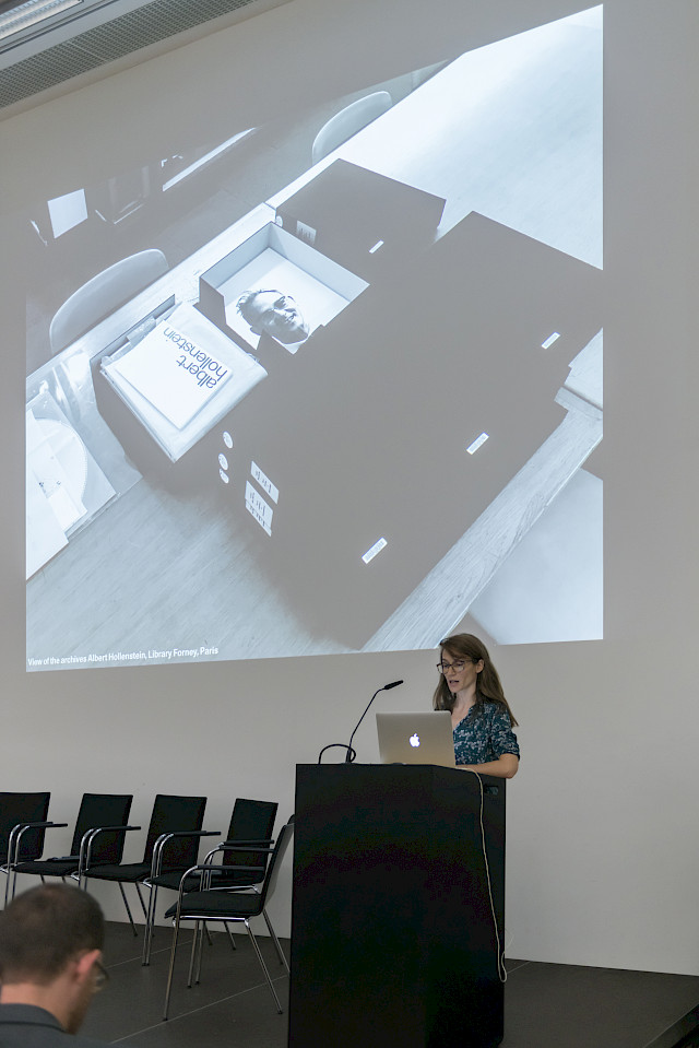
Finally, researchers of the sub-project C dedicated to strategies of dissemination presented a joint case study aiming at getting started and “testing their engines.” Roland Früh, Ueli Kaufmann and Sara Zeller examined the catalogues of the Kunsthalle Bern in order to understand how the variety of their designs came to be, placing them outside the usual canon of Swiss graphic design history.
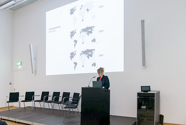
After taking a break for lunch during which many informal conversations took place between participants and experts, the day continued with table presentations displaying the research material used by the different sub-projects. Sub-project A showed originals and reproductions of student work obtained from the designers themselves in order to try and understand the evolution of the curriculum; the display included timetables and a large timeline retracing the key actors at the Zürcher Schule, and works by Eidenbenz (negatives, originals, and photographs of works arranged on paper). Sub-project B presented primary and secondary material: objects obtained from the archives of former designers at Olivetti and a recorded interview, a database realised for the Panorama exhibition (retracing graphic design in French-speaking Switzerland), existing literature which triggered the research and a first mapping of designers’ networks. Finally, sub-project C exhibited a vast selection of catalogues from both the Kunsthalle Bern and other institutions. The catalogues from the Kunsthalle showed a clear evolution after the pivotal 1969 publication by Harald Szeemann When Attitudes Become Form, which introduced a conceptual approach that was further developed later on when the institution developed close links with designers that allowed for an idiosyncratic scene to emerge.

The presentations triggered feedback from all participants and lead to passionate discussions that unfolded during the entire afternoon: indeed, the physical presence of raw material allowed an immediate reaction and one that cast a fresh eye on both the possibilities offered and the eventual pitfalls that should be avoided.

Finally, the day was wrapped up with final observations by the experts. For instance, Teal Triggs offered four valuable observations: first, the importance of defining terms used in the various research projects; second, the novel position held by researchers who are also practitioners, which allows them to approach the project “as designers” but simultaneously induces a greater importance of applying methods thoroughly; third, the significance of relationships and contexts in the history we are writing through the project; and finally, in a stimulating last point, she encouraged a meta-critical approach not only to the material but also to the research questions employed to unpack the material at hand.

There is no doubt all participants benefited from sharing the current state of their research and source material, not only as a means to recap the first months of research but also to submit it to thorough review by both experts and researchers alike. In fact, this milestone meeting proved so beneficial that all agreed to a twice-yearly meeting in Bern – a key moment to look forward to.

Mapping the Digital Arts and Graphic Design Scene in New York – a research trip

During the first week of December 2016 a group of students from the Institute of Art History at the University of Bern had the opportunity to participate in a research trip to New York City. It was organized by Prof. Dr Peter Schneemann and Dr Yvonne Schweizer and – by means of partial study grants – generously funded by the US Embassy in Switzerland. Ueli Kaufmann and Sara Zeller, both doctoral students in sub-project C (coordinated by Prof. Dr Schneemann) were among the lucky few to board the plane.

The program of the research trip included visits to archives, institutions or artists of particular interest in order to actively engage in discussion and exchange with art practitioners, curators, writers, academics and representatives of cultural institutions. While the main focus was laid on the city’s digital art scene, the group also had the opportunity to visit two archives that are valuable sources and contacts to the SGDTR research project – the Museum of Modern Art (MoMA) Archives and the Herb Lubalin Study Center at Cooper Union.

MoMA Archives

Michelle Elligott, Chief of MoMA Archives, welcomed the group in the archives’ reading room, where she had already prepared variegated material. Within the process of organizing the meeting, Sara Zeller had the possibility to ask for files, connected to SGDTR’s research interests. Elligott walked the group through interesting examples of correspondence on the MoMA’s visual identity and pulled a folder about “Swiss Posters”, a Swiss traveling exhibition from 1949 to1950, which took place at MoMA in 1951 and was funded by the Swiss Embassy in Washington.

Highly interesting to researchers from various fields are the digitized and publicly accessible documents which MoMA archives provides for every exhibition held between 1929 and 1989. Through the finder on MoMA’s website, one can access a checklist showing all material filed for each exhibition, including press releases and in some cases even installation views.

Herb Lubalin Study Center of Design and Typography

Alexander Tochilovsky welcomed us at the Herb Lubalin Study Center of Design and Typography, which is part of the The Cooper Union and located at 41 Cooper Square. The Lubalin Center was opened in 1985 as a memorial to famous graphic designer and Cooper Union graduate Herb Lubalin (1918–1981) and holds the largest collection of his works. Unfortunately, correspondence or sketches were not considered valuable or interesting after his passing and therefore didn’t find their way into the archive.

Since its establishment, the collection has expanded and today also features other internationally renowned graphic designer’s works (such as those by Lou Dorfsman, Karl Gerstner and Massimo Vignelli).

Key audience of the Lubalin Center are Cooper Union students. But on appointment, everyone can visit the archive in order to have a close look at whichever item one might be interested in or to simply browse through the library of books and magazines on graphic design. Alexander Tochilovsky’s regular exhibitions and other projects also reach out to a broader public. Through his work as both curator and teacher, he is determined to raise interest for graphic design history and have people experience the benefits of looking at original material.

© Bianca Ott
© Bianca Ott

“Werbung konkret” an oral-history-evening co-presented by SGDTR

Who does not remember the iconic plastic bag with its six pink and three orange circles – part of the audience from carrying it around by themselves, the younger part from a lecture or a book on Swiss graphic design history. But all in the crowded Literaturhaus Zürich on December, 8, 2016 were keen on learning more about the backgrounds that led to this unique collaboration between the Swiss retailer Au Bon Marché (ABM), the design studio Atelier E+U Hiestand and the author Eugen Gomringer. SGDTR is proud to have jointly prepared and presented this panel discussion with Eugen Gomringer, Ursula and Ernst Hiestand moderated by Martin Heller together with the Strauhof and the Vertiefung Visuelle Kommunikation ZHdK.

In the beginning the audience learned more about the roots of this cooperation and the network of involved stakeholders. Thus, Gomringer and Hiestands first met in the context of the Schweizerischer Werkbund (SWB) and started their collaboration in 1958/59, when Hiestands contributed the visual design and Gomringer the texts for the Swiss producer of abrasive paper SIA. The commission for designing ABM was given by Georges Cavelti, who run the retailer from 1963 to 1989, and closely accompanied by himself and Otti Weibl, head on the in-house marketing section and responsible for advertising, who was present in the audience and added some interesting insights to the discussion.

The panel also shed a light on the preconditions and objectives of the ABM communication. According to Hiestands and Gomringer, self-service shops were a new phenomenon of mass consumption in Switzerland. As a result “sales conversations with customers had to be led by the labels”, as Otti Weibl puts it. As there were no established forms of communication they could refer to, they had to create a new visual and textual language based on the business concept of ABM, which was to sell well-priced but high-quality clothing and household goods to a growing middle class. “They sold everyday objects not fashion items”, as Ursula Hiestand pointed out, which led to the stripped down but highly attractive aesthetics that were applied to countless means of communication, including the iconic plastic bag.

“Swiss team” hosts a panel on Swiss style and migrations at the 10th ICDHS Conference in Taipei, Taiwan

On the occasion of the 10th International Conference on Design History and Studies hosted at National Taiwan University of Science and Technology (October 26-28, 2016), a group of members of the research project Swiss Graphic Design and Typography Revisited has convened the audience for various papers.

On Thursday 27 October, Robert Lzicar and Davide Fornari (SGDTR coordinators) opened the panel titled “Le Style Suisse n’existe pas: How Migration Shaped the ‘Graphic Design Nation’”. The idea of Swiss graphic design and typography and its dispersion through migrations was at the core of the three presentations, framed by the awareness of how “migration” has become a debated issue since the Swiss referendum of February 2014.

The dissemination of the theories developed in Switzerland throughout the 20th century, which have shaped the international practice in graphic design and visual communication until today, can be traced back to the migration of objects, people and ideas, as well as to corresponding economic and political decisions. The panel discussed different forms, meanings and consequences of internal and external migration in the context of Swiss graphic design.

Leslie Kennedy (expert and contributor of sub-project A) presented a paper titled “The International Weiterbildungsklasse für Grafik, Basel School of Design 1968-1988: Dispersing ‘Swiss Style’ through Education”, reporting on the dissemination of a Swiss model of teaching and learning graphic design. Davide Fornari displayed the very first results of his archival research with “Walter Ballmer: Designing Networks Between Switzerland and Italy”. Sara Zeller (PhD candidate in sub-project C) together with Robert Lzicar analyzed in an original way a series of posters focusing on Swiss stereotypes, “Exporting Swissness: Swiss Traditions and Visual Stereotypes in Contemporary Graphic Design”.

The panel argued that migration contributed to the development of “Swiss graphic design” from a style towards an asset part of the national heritage. Its candidature to UNESCO Intangible Cultural Heritage has made mandatory a critical discussion of the branding of Switzerland as a “graphic design nation”. Full room and vivacious debate ensued, proving a strong and worldwide spread interest in the topic.

Further contributions to the subject beyond the panel were delivered by Davide Fornari and Giovanni Profeta with the poster “Swiss Style Beyond the Border: Swiss Graphic Designers in Italy” involving an infographic on the migration movement of designers between Italy and Switzerland and by Sarah Klein (PhD candidate in sub-project A) presenting her paper “Migrating Method: Eidenbenz' Early Systematic Course in Lettering”.

© ICDHS Taipei
© ICDHS Taipei

Kick-Off day of ‘Swiss Graphic Design and Typography Revisited’

Friday 7th October was the Kick-Off day of ‘Swiss Graphic Design and Typography Revisited’ research project. Four years have passed since a working group met at Bern University of the Arts in 2012 with the aim of documenting the field of graphic design history in Switzerland. The working group developed into a conference (February 2014), the conference into an application for funding, and the application into a three years research project funded by the Sinergia-Project involving most of the Swiss universities of applied arts (ECAL, FHNW HGK, HEAD, SUPSI, ZHdK and HKB) and the University of Bern.

Team members met for the first time in the Grosse Aula at HKB: six PhD candidates, nine researchers, three co-applicants and the management group. Introductions evidenced a multicultural, multilingual and mixed-background environment that will enliven discussions and offer ever different perspectives and challenging viewpoints. Robert Lzicar presented the project conveying bureaucratic details with a thrilled and proud attitude. Final scientific goals were set, dos and don’ts listed and next steps organised.

Then, each of the three sub-projects had time to discuss separately. Reporting back to the rest of the research group, first issues emerged: sub-project A – Principles of Education – reflected on the so-perceived bias on typography and type design of the group’s case studies; sub-project B – Networks of Practice – pointed out the irony and possible challenges of being a group of four different nationalities (Swiss, Swiss-American, French, Italian) living in four different cities (Zurich, Geneva, Lausanne, and London) and two different countries (Switzerland and UK) researching on networks beyond national and linguistic boundaries; sub-project C – Strategies of Dissemination – questioned the very idea of Swissness and national design. Links between each of the nine case studies were made evident and the dialogue between sub-projects was encouraged highlighting the benefits of multidisciplinary collaborations between research groups.

Members of each sub-project will meet separately in the next months, but all team members will meet again in Bern in January for a workshop dedicated to methodology.